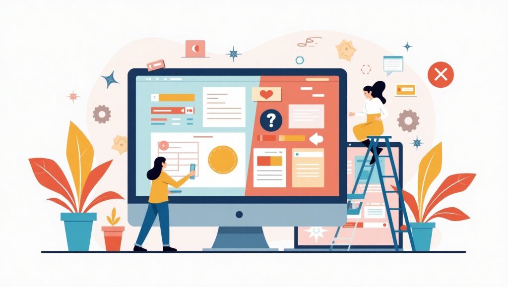
The Basics of What Makes a Design “Good” or “Bad”
Design inherently is nothing more than communication. The good design succeeds in integrating the right message while the bad design drives beyond comprehension or overwhelms the viewer. But let us not go too far into the crib definitions. Just think about how you feel when encountering a neat, well-organized website-everything flows like the nice visuals, and the clicking is easy to know. That’s good design, which really is intuitive.
Good design is purposeful. Whether it’s a website, a mobile application, a poster, or a product, it is created to solve a problem or meet a need for a user. A bad design works, in contrast, significantly like a dead-end road-in either way too much or too little, thus leaving the user confused or frustrated.
You don’t need to be a designer to know bad design. It’s like not connecting with neon fonts and broken links on a website. Or, it’s like not finding the contact information on the menu. These annoyances are red flags.
Design would deal with making it work and not just making it carved. You can have the most beautiful arrangement but, for the users, it’s unusable; it does not do its job. That is a crucial point that beginner miss.
Good design is right, honest, drown clear, and user-centered. Bad design is confusing, messy, and self-centered. And once you start looking at design through that lens, it’s surprisingly easy to tell the difference.
Why Purpose and Clarity Are the Cornerstones of Good Design
A good design process begins by discovering the clear purpose of the design. Ask: what is the user trying to accomplish here? It could be filling out the form, buying an item, or reading information—each and every element in a webpage should adhere to this journey. Eliminating options is crucial; too many decisions lead to fatigue. When everything feels right and looks good, there should hardly be any thinking involved for users.
Consider a contact form when thinking about good forms design. There, labels used will obviously describe the data requested, the layout will be very simple, and only information that is truly necessary will be requested. A badly designed form? That’s one with twenty fields, unclear error messages, and a layout so cluttered that users give up halfway.
Visual hierarchy also plays a big role here- guiding the eye of the user with headings, subheadings, icons, or contrast of colours. If important things are clearly highlighted on your page design, users will feel assured and engaged. On the other hand, a poorly structured design may compel visitors to exit your site regardless of the worthiness of your content.
A well-designed interface is like a cordial hostess guiding you to the next destination; poorly designed interfaces leave you wandering aimlessly in a store void of all signs. That might look good at first glance, but without purpose it will quickly wear itself into a poor experience.
Visual Appeal Isn’t Everything—But It Still Matters

Honestly, first impressions are everything. And the first thing a person would usually notice about an organization would be its visual design. A good design would look much shiny and modern and complement the personality of the brand selling and standing up. It does not necessarily need to become those flashy or animated kinds, often simplicity beats complexity.
And then comes bad design, replete with jarring colors, illegible fonts, and an overstimulation of visuals vying for attention. If it hurts to look at or squints, it is a sure sign that it needs redesigning. A lot of times, bad design is nothing to do with pure badness, but simply old-fashioned. Like those sites still in the early 2000s with their gradient buttons and spinning logos-yikes.
What is certainly good design is the perfect blend of form and function. It is certainly good to look at but fundamentally prioritizes usability. Design decisions should enhance content rather than distract from it. Colors can help create emotions, direct attention, or strengthen branding-but only when used purposefully.
Pretend to cloak yourself with appropriate clothes just for an important meeting. You want to look good and not dress for it. The same thing applies to design. If something has the clutter or seems inconsistent, there is a likelihood that it is bad design.
After all, beauty is an enhancer of user experience, but it cannot overshadow usability. Good designs have the best balance between looking good and working even better.
The Role of Consistency and Branding in Visual Design
Consistency is the glue of visual design. Fathom visiting a site with completely different design components on each page. Confusing, right? Good design always adheres to a defined style: fonts, colors, icons, buttons, etc., to set user expectations. This is where branding comes in: not just sticking your logo in the corner here and there but building trust. If your design looks like it matches your brand’s voice, whether that’s fun/whimsical or polished/serious, this will create a consistent experience all around.
Bad design feels off. Maybe the home page shone, but the blog looked like a separate entity. Or colors were just about anywhere, creating an uneven experience. Typography is another aspect where consistency matters: a plethora of font styles and sizes could easily cause visual chaos. On the other hand, smart application of typography can focus a user’s attention, provide hierarchy, and offer easy understanding of content.
Icon styles, button designs, and image styles should work together. If one section has bright orange CTA buttons while another has dull grey buttons, the user won’t even know what to click on.
Hence, creativity is to be respected as much as discipline. A well-managed, consistent visual identity gives your work credibility and facilitates user trust and comfort.
User Experience: The Heart of Every Design Decision
Ultimately, it all depends on the users. A design can be full of awards for the aesthetics. But if it is not easy for users to use it, what’s the point? Good design is all about empathy in understanding how people think, feel, and interact with your product.
Big indication that you are discovering quality design? You wouldn’t notice it. This is because everything works the way you expect it to. The navigation makes sense, buttons respond naturally, and the journey feels smooth from start to finish.
While bad design, by contrast, causes friction, something between a three-click navigation and an interestingly obscure mobile version produces different effects. Or you try to purchase an item but cannot see the Add to Cart button. Such small aggravations grow, and they drive customers away.
Good designers understand the importance of time spent in testing and perfecting the user experience-they listen to feedback of real people, study how people use the product, and improve the flows based on those learnings. Every design decision, no matter how minute, should always prioritize the users.
Think of UX as the emotional layer of design-it is what makes a person go “That was easy!” or say, “Forget it, I’m going elsewhere.” Good UX may not always be seen, but it can definitely be felt when it’s there-and when it’s not.
How to Spot Good UX in Everyday Digital Products
You know what how you experience the digital product on your everyday life, that should be telling you enough about what brings good user experience. Really, when was the last time you said “Wow, that was fast and easy”? That’s UX done right.
Take an example like Amazon, which knows how to accomplish buying almost too easily-from filtering options to one-click purchase-all optimized for effort minimization. What they tell you is along the lines of, “follow us now, and wait until you see what happens next.”
Screen reader, keyboard navigation or contrast between text and background to read all good UX are accessibility features. If the product does not allow certain users access through wrong design, that’s already a fail.
Another mark of great UX is such that it makes understanding of errors easy. A good design tells what went wrong and recommends possible solutions instead of using roundabout language like “something went wrong.” It could point out that there’s an empty field or specify an acceptable format. It’s a minor thing but makes all the difference.
Bad experiences usually scream frustration, betrayed by the truth and nothing but the truth. If you find yourself lost, stumbling, or clicking the back button too much, it’s definitely because ‘design’ hasn’t given much thought to the user’s journey.
You must trust your instincts, because when it feels smooth, that it really helps and is natural – it’s probably good UX. In fact, that is what distinguishes average design from great design.