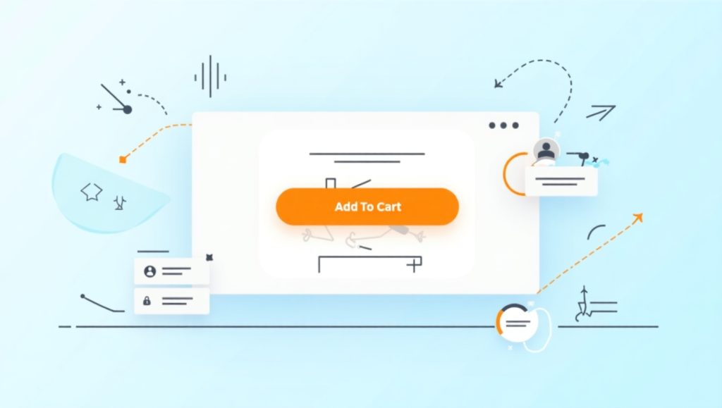
The Importance of the Add to Cart Button in Online Shopping
Though small as a feature of your online website, the “Add to Cart” button is among the very huge things in e-commerce. Don’t think about that as the simple act of adding a product to a cart; think of it as a handshake between your product and the customer; it is the one point where browsing visitors become potential buyers. With good button design, it could immediately convert into higher conversions and lower abandonments. However, if neglected, it silently costs you sales.
E-commerce is without any face-to-face selling or any salesperson helping the customer choose the right product. The interface has to do all convincing-and your Add to Cart button is one of those important tools. It is the cue that says “you are there!” and could ease customer sales progress without friction.
Trust and usability are also shown by this. When consumers can quickly and clearly identify which options to click on and what happens next, their experience is smoother. So you lessen hesitation, build confidence, and help them move ahead very naturally. So let’s now dissect exactly what makes this button effective-it’s not only design, color, or placement, but even wording plays a much bigger part than you really think. Plus, of course, every e-commerce store has some minor difference, so testing and personalization is the key.
Design and Placement: Why Visuals and Location Matter
It can either entice or disorient a potential buyer depending on how the Add to Cart button is designed or located. For this reason, much thought should be given to design and location. First things first-the visuals.
Above all, color psychology holds the largest weight. Brightly clashing colors-calls like orange, green, or blue-often work best but then again, only if these colors starkly contrast your site’s color scheme. Make it pop and make it very clear that this is the next step while that will be achieved by contrast. If my background is white, the grey button will take it away and therefore, people will ignore it. Then size comes in. A tiny button that gets lost on the page is easily skipped over. What about this giant button? Well, it’s either pushy or sits terribly with the rest of the design. Aim for balance- large enough to be noticed, but aligned with the overall page design.
Now let us think of the placement. By rule of thumb, the best place to locate it is next to product details, usually close to the price tag and above the fold (without needing to scroll to see it). If a user has to hunt for your button, you have already lost part of the battle. Icons can help too. This brings us to a juncture of small shopping cart icon next to the button. Don’t forget about mobile users either! Ensure that the button has equal visibility and tappability on small screens.
Color Psychology and Contrast
Color does evoke feelings and reactions from users. Red typically signals urgency; green very often is associated with “go” or success; orange serves as a good option for a call to action since it tends to be friendly. But the ideal color will depend on the palette of your site.
You cannot argue against contrast. A button in high contrast catches attention and gently directs the user toward it. You can A-B test colors using Google Optimize or VWO to find out which one appeals to your audience more.
Button Size and Shape
A rectangular button with slightly rounded corners may often work best. Practical reasons for this are familiarity: Our brains recognize that as clickable. Oversize buttons can feel aggressive, and tiny ones can cause great problems in interaction, especially for mobile applications. So judging around 45×45 pixels would be just perfect for touch targets.
Let this also take into consideration white space. Leave your button to breathe: Clutter does worse than clear appearance; subtle substance and the space build trust.
Wording and Microcopy: Choosing the Right Words
The choice of words on your button can effectively nudge or push the customers from the store. It sounds dramatic, but it’s true. “Add to Cart” is what everyone still uses for pretty obvious reasons-clear and quite familiar. But, sometimes, you might actually have it more when you use more specific or even action-oriented language.
For instance, if you happen to sell digital products, something like “Download Now” could work better. If you sell handmade products, this can be said more like “Reserve Yours.” The important thing is to be mindful about the wording to match that of the customers’ mindset and the kind of products.
Tone matters too. Celia speak and touches will make the experience personalized. Avoid vague terms such as “Submit” or “Proceed,” which do not explain at all what exactly happens.
Add a bit of reassurance in the microcopy below the button as well, such as: “You will be able to edit your cart anytime.” It decreases the anxiety and sets the shoppers free to consider themselves in control.
Using Action-Oriented Language
Action-oriented copy encourages movement. “Get Yours Now,” “Add & Continue,” or “Buy It Today” creates a sense of momentum. It’s a small nudge, but enough to help the shopper take that next step.
Even subtle tweaks can lead to big differences. A/B tests have shown that buttons labeled with verbs like “Get” or “Try” often outperform generic options. Just make sure it feels natural and doesn’t overpromise.
Aligning with Buyer Intent
Your button should reflect where the buyer is in their journey. If they’re still exploring, softer language like “Save for Later” might work alongside “Add to Cart.” If they’re ready to buy, strong CTAs like “Secure Checkout” or “Buy Now” make more sense.
Understanding your audience’s mindset and matching your words to their intent can lower hesitation and improve click-through rates.
Building Trust Through Button Behavior and Feedback
If trust is the unsung hero of e-commerce, then a button plays its small part in building trust. For example, when someone clicks “Add to Cart,” a clear communication would be required to tell that the thing happened, like a little animation, a change in cart icon, or a message like: “Item added!”
Silence, lag or unclear reactions can confuse users. They might click multiple times without being sure that their action actually worked or may even abandon the process completely.
Another thing that builds trust is security. Add little seals or captions that say things like “Secure Checkout” or “30-Day Return Guarantee.” This could even be a nearby microcopy because it really doesn’t have to be on the button.
Consistency also counts. A button should behave across pages the same way. If one page says “Add to Cart” and the next one says “Buy Now” while meaning the same thing, doubt is created.
So let’s take a look into how visual feedback and trust signals can reinforce confidence.
Visual Feedback and Confirmation
This immediate feedback is paramount. An action as simple as the color of the button changing or the cart icon being updated enables users to know that their action has been registered. Additionally, using pop-ups or small modals to confirm that the item has been added could also be useful.
Enhancing this with options such as “Continue Shopping” or “Go to Cart” would give a sense of control to the user and improve the experience.
Trust Signals Near the Button
Well, I mean, even after everything, truth is not something designed. Rather, it is supported by the adjuncts that come with the button: You should put microcopy like No credit card required or badges such as SSL Secure Checkout beside the button. It tells that you are trustworthy and secure.
Especially in the case of new or smaller e-commerce stores, trust signals are often the deciding factor in whether a visitor converts. Therefore, every visible thing around the button must bring reassurance rather than distraction for the customer.
Testing and Optimizing for Conversion
Guessing what works isn’t the only option; it testing it isn’t the only option; it isn’t. Smarter E-commerce brands perform both actions. Enter A/B testing. Sample with various button colors and text, or different placements and microcopy. It may surprise you.
You can start with one change at a time, such as turning “Add to Cart” into “Buy Now” and testing the effect. Hotjar, Crazy Egg, or Google Optimize can be used to provide insight into user behavior, such as what areas they click on most as well as how far they scroll before passing through a button.
Segmentation of users will also help. New users have to nudge a little further so that they may end up buying really soon, whereas repeat users would directly go for a much faster, frictionless journey.
So the optimization never ends; usually behind top-converting buttons, there are stacks and piles of sweet little changes made over time. Let’s have a closer look at the tools and strategies that will help you optimize effectively.
A/B Testing Tools and Strategy
A/B testing is all about comparing two or more versions of a button to see which one drives better results. Don’t just test colors—experiment with shapes, copy, and even placement. Be sure to run tests long enough to gather meaningful data.
Use platforms like Optimizely, VWO, or Google Optimize. These tools let you easily set up variants and track results.
Analyzing User Behavior
Heatmaps and session recordings are sheer gold mines for insight. They provide the information for such tools as Hotjar and Crazy Egg, which allow one to learn where clicks, scrolls, and abandons took place in a user path. If many visitors aren’t seeing your button or even hovering but aren’t clicking, you’ve got a visibility or a clarity issue.
Use that data to refine your designs. It’s not guesswork at all, but actually what happens in the real world. It’s showing that and kind of changing it.