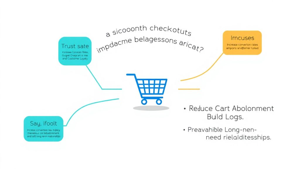
The Psychology Behind Checkout Friction
When chosen to be on your website and when they start to look around, you need to be aware that everything, from visuals and design and layout will impact the customer. However, once the customer decides they want to make a purchase, it is when they experience your checkout process that becomes the most pivotal time. A smooth checkout process eliminates any doubt or frustration and will only help secure the buyer’s confidence in their decision. Friction, in any form, will usually trigger doubt—whether that is a long boring form to fill out, unclear payment options or added on costs—leading to hesitation and typically to later cart abandonment. Studies show that upon redemption, more than 70% of carts end up deserted and friction with the checkout process is a big reason.
Questioning if the brand can be relied upon to deliver the goods—worrying if the payment method is secure—friction is demotivating. Quite the opposite, a seamless checkout process builds trust. It appears as though the brand is valuing the buyer’s time. Consider the 1-click buying option on Amazon—a checkout experience that embodies frictionless efficiency, no repetitive steps, no unexpected charges, and just smooth sailing from cart landing to checkout confirmation.
Furthermore, in our ever-increasingly fast-paced digital world, people are constantly seeking ways to make their lives easier. If users need to re-enter shipping info time after time, or cannot locate a payment method that meets their demand, they will make their shopping experience increasingly frustrating.
Reducing Abandonment Through Design Simplicity
Screening checkout pages that are cluttered can lead to confusion for users. Creating a clean, focused design is important to help keep users on track. Elegant, simple designs serve an important purpose beyond aesthetics – they help the user complete their purchase. When each button, field, and step are deliberately located within the budget page, the process is clear and leads to natural movement through the purchase experience.
The following is a good rule of thumb: don’t make them think. Remove useless distractions, like pop-ups, while retaining necessary information fields, and navigation systems. Embed/Highlight base level actions, like shipping options, payment information, etc, near the bottom and within the flow and maintain a clean flow to guide the user.
One effective technique is to use a progress indicator – it gives users a perspective on how many steps are left and assures them they are almost there. Building an understanding that the user is close to finishing will reduce the likelihood of abandonment. Compatibility with mobile systems is an absolute necessity! These systems are designed to make that task easier. If your tool is not easy to navigate on a mobile device you are making the user, who likely wants a mobile shout out, abandon the process, effectively closing the tapa on one piece of the user base.
Beyond the user experience, it is also important to build trust easily into the process. A few well-placed badges (SSL secure, method of payment supported, and positive review acknowledgments) just before the user finalizes the project can offer the few extra bits of reassurance that can eliminate last-minute second thoughts. Small touches – auto-filling users data, remembering user preference all help a user feel valued.
Finally, once you design the process, make sure you test it. Consider implementing A/B testing to look at how just changing the layout or copy can affect completion rates. Just a slight change in a word can lead to a huge change in the success rate – take a plaza approach.
If you are already making an investment in website design swansea then you need to take the time to make sure that the checkout flow has received the same attention to detail. Simple, user-first design creates better sales and deeper loyalty through consistent and easy experiences.
Payment Flexibility Builds Trust and Satisfaction
Payment is arguably the most sensitive step in the checkout process. At this point, users are prepared to hand over their money—and if something goes wrong or feels off, they will bolt. This is why it is so important to have multiple payment types and to have easy and secure transactions.
Each customer has their own preferences. Some are willing to go with PayPal, because of PayPal buyer protection, while others may pay more for transactions through Apple Pay or Google Pay simply for speed. More still will use the option of “Buy Now, Pay Later” options like Klarna or Afterpay. By catering to these options, you remove any barriers. It says to your customers, “We have thought about your needs.”
Security is another giant factor. If your site displays SSL certificates, is secured by HTTPS, and has third-party security validation, they should be feeling at ease. Additionally, being transparent about what happens to their data also helps build that level of trust.
And when thinking of payments, do not forget about mobile payments. An increasing amount of users now are purchasing directly from their phones. Your checkout process should at least support tap-to-pay or to use their digital wallets. To not be able to do so would be leaving money on the table.
To go a step further, some brands will also retain the customer’s payment preference for future uses (with consent). This can further speed up the process and let the repeat customers feel that they have been recognized.
In the end, flexibility in payment isn’t only a functionality. It’s a trust mechanism, as with design layout web design getting technology to match what humans actually want.
Loyalty Programs and Seamless Checkout Integration
Bringing your loyalty program into the checkout process is huge! Brands so often treat loyalty as an afterthought and only consider it after the purchase is completed when they ask a user to sign up or log in to their account. But what if it was part of the natural progression of checkout?
For example, an already-returning user is logged in and checking out. As they check out, you can automatically apply those points or discounts so they see their loyalty pay off in real-time. If they make the purchase, you are encouraging their future purchases, and importantly you are making the buyer feel like their previous decisions mattered.
And for new users you can, at checkout, provide a fast and easy streamlined choices to sign-up for your rewards program with simple value statements (e.g., “sign up now to receive 10% when you complete your order”) that provide enticement while avoiding being overly salesy. Again, the goal here is to keep it easy, fast, and beneficial for the user.
All of this is framed as loyalty that feels like a reward for people, not a job. And you can layer in gamification–such as a progress bar that helps the user see how close they are to getting a reward at the next tier–and giving the user a sense of achievement and positive reinforcement, only strengthens the reward of loyalty.
I would also suggest linking loyalty benefits to a frictionless checkout experience. For example, you can offer free shipping on all orders for in-store members, for example, you can develop exclusive payment methods, or work to save their preferences to streamline and make the journey easier.
If your focus is web design swansea, this integration should be a core part of your strategy as opposed to an add-on. An integrated and smooth checkout that promotes loyalty is a cycle of satisfaction that keeps the customer coming back.3
Conclusion
Ultimately, a straightforward and pleasant checkout experience does not just help improve conversion rates, it fosters long-lasting relationships. Each second saved, each friction removed, and each choice remembered, accumulates in the mind of the consumer. Loyalty is not branded rewards explains or reminders in emails, it is about trust, consistency, and ease.
As competition in the digital space becomes more apparent, companies that are powered by user-centric design and approach the experience by thinking beyond the home page to checkout will be retailers to remember. There are no points for answering the complex question of how to make the shopper experience better—everyone will arrive at similar solutions at the end of the day.