A comfortable payment gateway isn’t just a payment processor; it plays an important part in providing an eCommerce experience that users can trust. We know that when users trust a payment process that is easy to navigate, conversions (and customer loyalty) increase and cart abandonment decreases. But what constitutes user-friendly?
In simple terminology, the three main principles of a payment gateway in the context of user experience are ease of use, security, and speed. Additionally, it must also be compatible. Once a customer gets to the checkout screen, it should be logical and simple for the user to check out. A user who has to stop to figure out how to enter their credit card information or is sent to a website they are not familiar with, for example, both create friction that can lead to lost sales.
With regard to branding, your payment gateway should blend easily with the branding and tone of your website. Whether you run a small retail site or a corporate level ecommerce site, consistency builds trust. Mobile optimization is equally important. A user-friendly payment gateway must function seamlessly on all devices. We know mobile-first frameworks are effectively seamless and easy to pay using a smartphone without having to pinch the screen or zoom in for viewing.
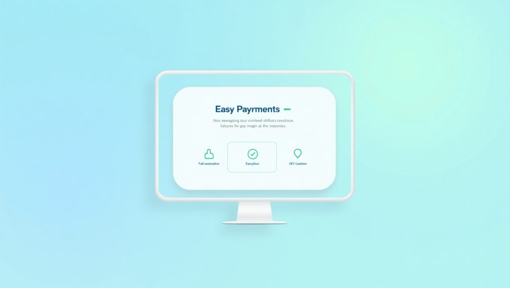
In addition, transparency in fees, timely confirmation messages, and the ability to support multiple payment methods also play a pivotal role in providing a better experience overall. PayPal, Stripe and Square are great examples of gateways that are user-first or customer-first in approach and continually working on their interfaces to improve the interaction.
The aim is simple: to make payments so easy that the customer barely knows they’ve paid. If you want to be different, then don’t just make your payment gateway functional, but make it feel effortless and welcoming. For further suggestions, check out Shopify’s great guide to choosing the right gateway.
The Role of Intuitive Design
Design plays a crucial role in providing users with a flow of payments that they can have faith in. If the payment page is filled with random junk ideas or confusing ways to represent payment – you’re wasting momentum on the most important decision which is purchase. A payment page that is intuitively designed should be obvious enough that even a first time user knows exactly what to do or finish the process. Another way to provide trust is the use of visual cues. For example, using a progress bar correctly, simple form patterns, and visual cues to confirm or reject the input fields gives the customer a control and comfort. If you integrate responsive web design principles, the layout adjusts automatically based on screen size, improving the experience across mobile, tablet, and desktop.
Customers are comfortable knowing they are headed in the right direction and most importantly what the next steps will require of them. Neither one of us likes to be excited about shopping online, especially for the most boring aspects like billing, shipping and payment, so if you can intelligently group your billing and shipping addresses, or utilize auto-fill for returning-users, you’re making the process better by making it less tedious.
Think about colours too. Using green for “Proceed to Pay” and blue for “Continue” has strong subconscious signals of what the user is doing and comfort. And keep error messages simple and amusing to read – present the issue with some suggestions of how to fix it. The more human you make your design the better it’s going to be liked.
In short, intuitive design doesn’t just look good—it reduces friction, builds trust, and improves conversion. It creates a psychological flow where users move from interest to action without second-guessing. And in an era where user attention is limited, that smoothness is gold.
How Payment Security Affects Usability
Security is imperative in an online transaction. However, what is often misunderstood is how security design interacts with usability design. An easy-to-use payment gateway will not only protect the user but also help the user feel protected while making the experience seamless.
To be clear, customers expect protection. But to be cumbersome regarding security information and actions (e.g., CAPTCHA, 3 redirect steps) can adversely affect usability. That is the role of security design. We typically design in a way that we are not aware (i.e., encryption, PCI compliance, tokenization), to protect securely and well.
A good user experience, will create cues to tell the customer that their transaction is protected, whether through the following: a lock icon, an SSL certificate, or querying the end user with “Secured by [Gateway Name]”. These will provide the much-needed assurance to support the experience. Transparency also creates trust.
Additionally, authentication methods such as 3D Secure 2.0 offer additional layers of protection while remaining relatively smooth. Biometric authentication (like Face ID) for mobile users speeds things up while improving safety.
From the moment users enter their information to when they hit “Confirm Payment,” they should feel confident, not confused. In fact, improving security-related user experience often helps reduce cart abandonment. When users don’t fear data loss or fraud, they’re more likely to complete the transaction.
The best gateways, like Stripe and Razorpay, focus on seamless yet secure experiences. Remember, you want the customer to feel safe—but never overwhelmed.
Balancing Safety and Convenience
The real challenge lies in finding that sweet spot between safety and convenience. Go too heavy on safety, and you might overwhelm or frustrate your customer. Too light, and you risk compromising their trust. A great payment gateway handles both, subtly.
Start with pre-filled fields for returning customers. These speed up the process while being secure, thanks to tokenization. One-click checkout is another helpful tool. It remembers user preferences safely, reducing the number of steps required next time.
Then there’s biometric authentication. Users love the ease of using Face ID or fingerprint logins because it feels both high-tech and secure. It’s especially effective on mobile and supports the growing trend of mobile-first shopping.
Another important point is real-time transaction alerts. When users receive instant confirmations or emails after a transaction, they gain peace of mind. Adding 2-step verification where necessary (without overdoing it) also works well for higher-value transactions.
In the end, users should never feel like they’re jumping through hoops just to buy something. Make it easy, make it safe, and they’ll come back. That’s what balancing security and convenience is all about—minimizing anxiety and maximizing satisfaction.
Supporting Multiple Payment Methods
Customers have preferences. Some like using their debit cards, others prefer digital wallets, and a growing number use Buy Now, Pay Later (BNPL) options. A user-friendly payment gateway supports these choices without bias or complexity.
One of the easiest ways to increase conversions is to simply offer more ways to pay. Not every customer has a credit card ready. By supporting methods like PayPal, Apple Pay, Google Pay, or even regional options like UPI or Klarna, you reduce friction for more users.
Flexibility also means allowing currency conversions for international customers. Multi-currency support, combined with localized payment options, shows users that you value their convenience—wherever they’re located.
It’s also essential that the payment interface adapts automatically based on the chosen method. For instance, selecting PayPal should redirect users securely and then bring them back with a confirmation. The transition must feel effortless and not disruptive.
Offering payment flexibility can also positively impact ecommerce SEO strategy, as customer retention and positive user experience are part of Google’s broader ranking factors.
In short, the more options you give your customers—without overcomplicating the interface—the more likely they are to complete their transaction. If a user gets to your checkout and sees their preferred method is missing, they might simply leave. That’s why diversity in payment support is key to usability.
Localized and Mobile Payment Integration
Think global, act local. A truly user-friendly payment gateway isn’t just multilingual—it also integrates local payment behaviors. In Asia, for example, QR code payments and UPI are huge. In Europe, bank transfers might dominate. Understanding these nuances can give your business a competitive edge.
In-app purchases also need special attention. If you run a mobile app or a WordPress ecommerce website , integrating the gateway within the app’s ecosystem reduces redirects and builds trust.
Mobile optimization is just as critical. According to recent data, over 70% of online shoppers use smartphones. Your payment gateway must be optimized for touch interactions, autofill, and speed. Laggy mobile interfaces or poor layout scaling can drive mobile users away fast.
Mobile wallets like Apple Pay or Samsung Pay are particularly useful because they speed up the checkout process significantly. Integration of NFC, facial recognition, and saved card data help complete transactions in seconds. This not only makes it easier but also makes users feel like the process was tailored just for them.