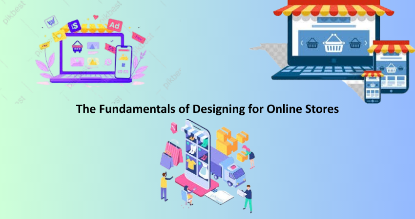
Introduction
Creating an online store is not merely developing a pretty website. It is about building an end-user experience that effortlessly takes visitors from browsing to buying. In the current highly competitive digital landscape, an e-commerce website design immediately influences conversion rates, client happiness, and ultimate business success. While good looks are valuable, the key to a successful online shop is how functional it is, how user-friendly it is, and how effective it is at completing transactions. For someone new to the e-commerce industry, knowing the basics of design can be the difference between a successful business and an unsuccessful venture.
The basics of e-commerce design cut deeper. These include usability, accessibility, mobile responsiveness, and general user experience. It’s not merely about amazing visitors with stylish layouts but also about eliminating all sources of friction that could discourage them from buying. From selecting the ideal layout and placing products in the most convenient way to simplifying the checkout and minimizing loading time, every choice of design counts. This article delves into the key aspects that every online store designer or businessperson should be familiar with when designing a high-converting and accessible e-commerce site from scratch.
Selecting the Correct Platform and Theme
Knowing Platform Choices
Having the correct e-commerce platform is an important starting point when designing an online store. Well-known platforms such as Shopify, WooCommerce (for WordPress), BigCommerce, and Magento provide distinct features that cater to varying sizes of businesses and types. For small-scale businesses or new store owners, platforms such as Shopify and WooCommerce tend to be suitable because they have friendly interfaces and less steep learning curves. Shopify, for instance, provides a single platform that takes care of hosting, security, and payment gateway integration. WooCommerce, however, offers customers more adaptability and customization capabilities, particularly if they already know WordPress. The selection between the two platforms must be based on your budget, technical ability level, and long-term scalability needs.
Every platform offers varying design capabilities, plugin compatibility, and community resources. If your store will grow quickly or sell specialized product configurations, you might require a platform that has more advanced functionality included out of the box. Magento is robust but demands a greater degree of technical expertise or developer assistance, so it’s best suited for high-end stores. Payment gateway integration, customer support, shipping integration, and SEO capabilities should also be weighed when selecting a platform. The base of your store’s layout will be on your platform selection, so you want to do extensive research and maybe even try out some trial versions before deciding.
Choosing a Professional Theme
After selecting a platform, your next decision will be choosing a theme that matches your brand and includes e-commerce functionality. A quality theme isn’t only about looks—it needs to be responsive, SEO-optimized, and adjustable. Most platforms have a vast collection of free and paid themes, each tailored to different niches and product categories. When assessing themes, carefully look at layout options, product showcase features, typography, and mobile-device compatibility. A theme that has a simple layout, big product images, and easy navigation can greatly improve shopping experience for your customers.
Customization options are also an important consideration. Even if a theme initially appears to be good, you’ll probably want to change colors, fonts, or layout areas to be more consistent with your brand identity. A quality theme should facilitate such changes easily without the need for advanced technical abilities. Opt for themes with integrated drag-and-drop builders or visual editing support. In addition, take into account how well the theme integrates third-party plugins and integrations you might require, like reviews, loyalty programs, or email marketing functionality. A good theme becomes an excellent design foundation and can prevent countless hours of reworking and tweaking your layout in the future.
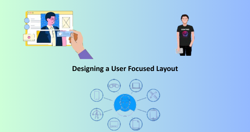
Designing a User Focused Layout
Streamlining Navigation and Site Organization
Friendly navigation is what helps cut down on friction and drive more conversions. Shoppers should be able to locate what they’re searching for in a few clicks. That requires having a well-structured menu with easy-to-use categories and subcategories. If you’re a clothing retailer, for example, you could have your navigation as Men > Shirts > Casual or Women > Accessories > Bags. Mega menus, filters, and search functionality will further improve discoverability, particularly for those that have a large product assortment. The intention is to lead users organically from the homepage to the product page without confusing or overwhelming them.
Apart from main navigation, other layout features assist with usability, including breadcrumb trails, clickable logos that go back to the homepage, and a visible cart icon. The footer menus can contain less than frequently accessed material such as return policies, about pages, and contact information. Maintaining primary navigation items uniform across the site enhances the shopping experience and decreases cognitive load. Additionally, refrain from cluttering by keeping menu items to a minimum and emphasizing the most valuable routes. An intentional site architecture promotes deeper browsing and results in increased average order value and improved customer satisfaction.
Prioritizing Mobile Responsiveness
As mobile commerce is a major proportion of the online purchase, mobile-first thinking is not optional when it comes to designing. Your site should be speedy and should render perfectly on different screen sizes and devices. Your buttons, images, and text should resize responsively to small screens without disturbing usability. Navigation menus in mobile should be collapsible (e.g., hamburger menus) to save space, and checkouts or similar forms should be touch-friendly and minimal. The quality of the mobile experience determines how likely users are to finish their purchases.
Mobile responsiveness is not merely layout; it also encompasses performance. Slow loads on mobile devices can result in high bounce rates and lost conversions. Optimize images, reduce scripts, and implement caching tools in order to speed up mobile performance. Touch gestures, swipe product galleries, and sticky CTAs can also improve mobile usability. Test your site extensively across all devices and browsers to maintain consistency. Google’s Mobile-Friendly Test tool is a good place to start identifying problems. A mobile-optimized design enhances the user experience as well as SEO ranks, allowing your store to reach more potential customers.
Designing High-Converting Product Pages
Prioritizing Visual Hierarchy and Product Imagery
Thinking of your product page as an online shop, it needs to evoke trust and clarity and cause excitement. A proper visual hierarchy must be established in order to guide customers’ attention. Usually, the image of the product will occupy the top half of the page, while the title, price, ratings, and “Add to Cart” button will be set next to it visibly. Next must come bulleted description, stock quantity, and delivery times. Having this important information above the fold indicates that scrolling will not be necessary for the user to make a decision. Careful use of color, space, and size will create a scannable visual hierarchy on the page.
Product images must be great in their quality. They need to have sharp definition, be zoomable, and be displayed in view from various angles. Lifestyle images and video clips can also assist buyers in imaginatively picturing the product in use in a real-world setting. If products are sold in different variations (size or color), then image previews should change with these updates dynamically. Such trust factors can help: reviews by customers, star ratings, and badges like “Best Seller” or “Limited Stock.” Decorate the visual design in ways that harmoniously complement the content to make a perfect and confidence-instilling shopping experience.
Writing Persuasive Product Descriptions
A good product description does not merely enumerate features—it sells a story. Start with a brief summary that calls out the product’s main benefits. Think about what need it fulfills or how it improves the life of your customer. Frame it with language that’s emotive, value-focused, and addresses directly your target customer. For instance, rather than claiming “100% cotton shirt,” say “Feel all-day comfort with our soft, breathable cotton shirt tailored for active lives.” Tone your language according to your brand personality—be it fun, business, or high-end.
Apart from the lead opening, split the description into easy-to-read sections or bullet points for specs, materials, care, and sizing. This enables customers to make an informed choice without being overwhelmed. Add naturally SEO-friendly keywords to enhance search rankings. Inserting FAQs, comparison charts, or user-generated content (i.e., customer reviews and photos) enhances the page. Finally, a good description establishes trust and eliminates apprehension, enabling users to click “Add to Cart” confidently.
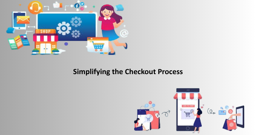
Simplifying the Checkout Process
Reducing Friction and Abandoned Carts
A very typical reason for missed sales for e-commerce is a complex or confusing checkout. To counter this, go for simplicity and speed. Provide guest checkout features to prevent account creation obligation, and minimize the number of fields. A progress tracker informs users where they stand in the process, while error messages need to be explanatory and informative. Payment possibilities should be diverse and familiar—credit cards, PayPal, Apple Pay, and buy-now-pay-later methods like Klarna or Afterpay make the process more flexible and accessible to more users.
Visual clarity and feedback matter here. Buttons. “Continue” or “Place Order” must be prominent and make users receive immediate feedback for actions such as the usage of a coupon or filling in a form. Lastly, make sure the checkout page itself loads fast and functions well on any device. Each additional click or pause can raise abandonment. Heatmap and session recording tools are great for figuring out areas of friction in your existing checkout process. By constantly optimizing, you decrease cart abandonment and boost completed purchases—converting more visitors to customers.
Establishing Trust At Checkout
Consumers are reluctant when divulging payment and personal information, so your checkout process needs to radiate trust. Begin with visuals: show secure payment symbols, SSL certification, and a clear visibility policy. Reassure customers with promises like “30-Day Free Returns” or “100% Money Back Guarantee.” These features diminish buyer fear and enhance confidence. Trust badges from recognized bodies like Norton, McAfee, or payment processors like Visa and PayPal also strengthen believability.
Leave an option for contact (chat, phone, or email) in case buyers have a last-minute question. A summary of the order details that is clearly visible on each step of payment, including transparent pricing, tax, and shipping amounts, avoids confusion and ensures transparency. Order tracking and confirmation via email also increases post-purchase trust. By ensuring users feel safe and guided during the checkout process, you not only seal more sales but lay the foundation for future loyalty and repeat business.
Conclusion
Building a great online store takes more than a sense of style—it takes a strategic approach to how consumers shop, how they build trust, and how they reduce friction. Each component of the design, from the layout of the home page to the last checkout button, is critical in driving shoppers to make a purchase. By concentrating on core concepts like platform choice, user-friendly design, mobile responsiveness, compelling product display, and an efficient checkout, you can create a shop that’s not only aesthetically pleasing but high-performing as well.
In a competitive digital economy with short attention spans, effective e-commerce design is a significant differentiator. It equips small businesses to compete with their bigger brethren and delights customers with an efficient and pleasant shopping experience. Whether it’s your first store or your attempt to optimize an existing one, going back to basics ensures that your site is user-friendly, conversion-driven, and poised to scale up with your business.