Introduction
In the speedily paced digital market, the first impressions matter a lot. A customer will have to form an impression in his mind within a maximum of a few seconds upon landing at a given online store. This impression is mainly influenced by the visual elements of the brand, whether color schemes, typography, imagery, or layout. Visual brand continuity at every possible touchpoint on the digital medium is important to having a cohesive identity that would easily be recognized and trusted by potential customers. Without this continuity, the very best intentioned e-commerce enterprise stands to look like a badly organized or even worse, wholly unprofessional business out of which he stands to lose credibility and sales.
What visual brand continuity is about is not just being pretty. It’s the tale behind the design integration, and how easy it captures and connects to the audiences makes for a whole felt experience of brand reliability. The placement of the logo, a style that matches product images, organization in menu arrangements, consistency of fonts and colors, and the overall site experience for the audience. It explores how online retailers can effectively maintain and implement visual brand continuity in their digital merchandise to enhance user experiences, increase trust, and drive conversions.
Importance of Visual Brand Continuity
Building Recognition and Trust
As far as brand vertical recognition is concerned, it is entirely dependent on visual consistency. Whenever customers come across an online store, they should link the way it looks and feels to the identity of your brand, right away. Repetitive exposure of a single design makes brand memory stronger as well as trust. A steady logo, brand colors, and tone will help consumers remember your brand in their next buying experience, advertisement, or recommendations.
Next to trust, reliability also comes to be foremost important today in e-commerce. Mismatched fonts, fluctuating colors, or awkward layouts of a website can mean it is not pro at all. Cohesive design signals much credibility about the attention paid to detail. When they trust what they see, users will then likely explore products, make purchases, return often, and keep up with the future shopping experience. Thus, it entails the psychological comfort and loyalty direct to your customers in the way they are visualized consistently.
Enhancing User Experience
With regards to making a good user experience, a consistent visual design alleviates the cognitive load of a user who, while using a well-structured site with familiar design elements, can quickly find information and make decisions. While uniformity in layout, typography, and colors can assist a visitor’s orderly and intuitive movement from one page to another and increase engagement while decreasing bounce rate.
Inconsistency creates disruptions along the user journey. When visual cues suddenly change from page to page, users tend to feel lost and confused regarding their next steps. This ends up leading to frustration and a potential loss in sales. With visual brand continuity, online stores are an opportunity to make the shopping experience easier and more enjoyable, thus encouraging a user to linger and explore longer.
Core Elements of Visual Brand Continuity
Logo Usage and Placement
Logos are the most visual expression in brand identity. In online stores, it usually sits in the same spot (top-left corner of the header) and acts as a clickable element that returns the user to the homepage. The importance of the same placement is that it promotes familiarity with the website through repetition; hence, users would feel the logo is an integral part of any page they visit, and that contributes to their branding experience.
Equally important, of course, is color, size, and space. The logo should remain recognizable and clear whether on a desktop or mobile device. Invoking any stretching, cropping, or other modifications that compromise brand guidelines is a major no-no in the online retail world. This type of uniformity creates that polished image, of course.
Color Palette and Typography
Color and typography aren’t just portrayals or representations. They are the complete storytellers of a brand personality. A color palette that is well-placed should be used throughout the entire online store-from product pages to banners, from call to action buttons through background. Every element should specify its unique function, such as showing promotion or guiding the user toward the checkout.
The typography also deals with font, size, and spacing. All should also be used in a consistent manner. Limiting your fonts to two to three will help cut down on confusion and vagueness. Heads, subheads, and body text should follow an understandable order through a hierarchy, so that the material can be efficiently skimmed with clear understanding. Unevenness in typography makes a site nauseous and sends the wrong message to visitors regarding the overall brand message.
Designing for Multi-Device Consistency

Responsive Design Principles
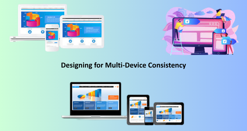
While operating a brand with one image across all screen sizes, shoppers are browsing from desktops, tablets, and smartphones. Responsive design allows for a layout and graphical elements of websites to be easily changed for use on a major subset of devices while still protecting usability and aesthetics. By maintaining proportionality among logotypes, applying the same scale of fonts, and resizing images as required, you guarantee a flawless user experience.
In addition, responsive design maintains the integrity of the brand’s visual identity. For instance, if a banner looks good on a desktop, it also has to look decent on mobile. Since spacing, alignments, and visual hierarchies are kept constant across devices, the consistency of the experience adds to the overall credibility and goodwill of your brand, keeping users engrossed by it on whichever device.
Cross-Browser Compatibility
Responsive design is concerned with screen sizes, while cross-browser compatibility guarantees your website has the same look across different web browsers-Crome, Firefox, Safari, and Edge. The difference in how browsers have been programmed to render HTML and CSS introduces visual differences, that is, eg. misalignment of buttons, broken images, or even distorted fonts.
Online retailers must ensure a rigorous testing process in multiple browsers and devices to guarantee that the site will look and function the same across them. Code should be standardized, the fonts should have fallback alternatives, and scalable vector graphics (SVGs) should be used for icons and logos. Investing in compatibility testing helps prevent first negative impressions and guarantees that every user, regardless of the platform, enjoys the brand the way you designed it.
Product Presentation and Imagery
Consistent Photography Style
Images of products are the very lifeblood of online shopping. A consistent photographic style strengthens brand identity and builds trust. This means that similar lighting might be used across all products, with backgrounds, angles, and sizes kept similar. High-quality, uniform images tell customers that your brand is serious and that the pictures they see online will be a true reflection of what they will get.
Mixed imagery-using different studio shots, lifestyle shots, and other styles with different resolutions-makes customers confused and detracts from the shopping experience. Good image guidelines should be developed and applied consistently across all product listings to provide a sense of visual coherence. This assists in further strengthening brand recognition while generating trust and higher conversion rates.
Iconography and Graphic Elements
In a nutshell, just as the icons and graphics should represent the complete visual language of the brand, it is important to use similar styles of icons–outline, filled, flat, or skeuomorphic–to enhance the brand personality so as to increase usability. More so, consistent design styles on navigation icons, shipping, and payment method logos should be applied.
There must be uniformity of callouts, badges, banners. All these will buttress the same border styles, the same drop shadows, same color treatment so that these elements will not create a clash with the other visual components. Again, all these create a smooth experience for users while reinforcing aesthetics important to the store, enabling more focus on products and promotions.
Integrating Branding in Marketing and Emails
Consistent Email Templates
Email marketing is a key extension of an online selling brand. Therefore, every newsletter, order confirmation, or promotional email must have the same look as the website. It should have similar logos, colors, fonts, and buttons. Templates built with such consistency help in brand recognition and strengthen this bond over time.
Making things personal can thus create a greater appeal, provided the design stays true to the brand. The templates should probably also be optimized for mobile and display for consistency across devices. Including links to your store with branded buttons and headers keeps driving traffic while providing a seamless and reassuringly familiar experience for the recipients.
Branding Across Social Media and Ads
Visual brand continuity not only thrives in the digital realm but flows into social media and online advertising. Social media profiles must use the same profile photo, color scheme, and post style as is on the main website. From that point on, it is considered a piece of branded content: a post, story, or reel with consistent branding and messaging.
In the same way, online ads, including display, PPC, and retargeting, must maintain visual congruity with your e-commerce site. This ensures a smooth transition when the user clicks through. Likewise, mixed messages between ads and landing pages create uncertainty or distrust. Uniformity across the different channels helps unify branding and builds recognition, strengthen returns, and encourage effectiveness.
Maintaining Brand Consistency Over Time

Creating and Using a Brand Style Guide
A brand style guide is therefore a very important document which makes sure that all digital assets are visually consistent-it provides a reference document showing how the brand is to be presented as per logo usage, color codes, font choices, image styles, and tone of voice. Everyone dealing with content writing, designing, or marketing must have access to and be aware of this guide.
Regular updates need to be made to guidelines to keep pace with a changing company brand-for example, the introduction of a new product line or a marketing campaign might prompt the addition of another guideline. Of course, if design standards were made institutional, all the content produced by new hires, freelancers, or third-party vendors would be in sync with the visual identity of the brand.
Training Teams and Auditing Visual Assets
The training trains the players here too, being committed to brand continuity, in maintaining the visual nomenclature of the brand among designers, developers, marketers, and customer service representatives, when it comes to how to do things. Regular workshops, onboardings, and review workshops might help in the reinforcement of the “best practice” to be avoided in a non-execution.
Equally important is the periodic audit of the digital assets. As time goes by, websites have banners that stay obsolete, pictures that do not relate, or colors that are not true to the brand.stands routine checks to gather these challenges and fix them. Implement a governance process for updates of content and management of visual assets to ensure that the store on-line continues to be aligned in 100 percent visual manner with the core brand identity.
Conclusion
Upkeeping an online store for the sake of visual brand cohesion is not a one-off affair, but rather a continuous exercise of quality and consistency, as well as engendering customer trust. Indeed, everything-from logo and typeface placements to responsive designs and social media applications-counts in shaping perceptions about brands. Consistency ensures that customers can easily navigate their way through your site, identify your brand across platforms, and trust their buying decisions.
Through investment in a formal brand style guide, experience of team training, as well as both manual audits and digital solutions, retailers can thus boast of a very solid as well as strong, unified visual identity within the online environment. Beyond aesthetics, such continuity builds brand loyalty, even stronger credibility, and further lays a fertile path for nurturing consistent growth in a tough competitive environment for e-commerce.