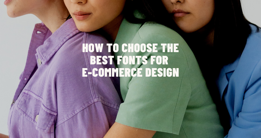
Introduction
The relevance of typography may not be readily apparent when compared to, say, web design or visuals where they have a heavy say in buying decisions. Interestingly, however, fonts do more than convey the written word; they create an image in the minds of consumers as they relate to the brand and its products on a web platform. The selection of fonts becomes an important aspect of the differentiators for an e-commerce website when deciding on the comfort and pleasure of the user journey. Each typographic decision matters, whether it concerns product descriptions or CTA buttons, headers, or mobile design. They all add to the overall identity and performance of the site.
The article delves into the considerations that must go into picking out the best fonts for e-commerce design in 2025, in terms of legibility, branding, responsiveness, psychological effects, and accessibility. New web technologies such as variable fonts, CSS font features, and retina displays provide e-commerce with a much more sophisticated approach to typography than ever before. Each section discusses diverse considerations determining e-commerce suitability for the font so that designers can make ergonomic decisions concerning aesthetics and conversion rate. Fonts are visual instruments as much as they are strategic means with which to draw users in and communicate the brand’s distinct personality in a very competitive digital marketplace.
Prioritizing Legibility and Readability Across Devices
Choosing Fonts That Are Easy to Scan and Read
The most important aspect that concerns e-commerce design is to ensure that the users easily comprehend and process information. The fonts must be extremely legible when it comes to product names, prices, and their descriptions, since most of the shopping goes on small mobile screens. Every e-commerce designer thinks of using sans-serif type faces, which at once demonstrate cleanliness, simplicity of geometry, and legibility at varying font sizes – Roboto, Open Sans, or Lato are obvious choices. This clarity is retained when shrunk or marshaled under different lighting, reducing the eye strain and enriching comprehension of users on the go.
The ability of a typeface to contribute positively to readability is enhanced through consideration of other typographic properties such as letter spacing, line height, an appropriate font weight, among others. Notably, excellent font selection fails when it is around an inadequate surrounding within which characters do not breathe enough. For instance, there is an intuitive and clean structure created by pairing body text in light-weight sans-serif with headings set in bold sans-serif typeface. As evidenced, this competitive-sensitivity measure is easily observable; sites have promising metrics of time-on-site, click-through rates, and bounce rates, which translate to more revenue. Hence, simplifying the consumption of reading-text through readable typography becomes a tangible competitive advantage.
Accounting for Screen Size Variability
Mobile shopping is an online commerce activity gaining ground with diversification in screen sizes and resolutions. Hence, when choosing the font, a consideration must be given to variability concerning screen size. The layout of one font may appear to be nicely aesthetic and readable on a 27-inch UHD desktop monitor while looking simply cramped and fuzzy-wuzzy on a 5.5-inch mobile screen. So, responsive typography comes under the basic necessity of contemporary e-commerce design. Designers and developers should prefer relative units like ems or rems to fixed pixel values, and CSS media queries should be used to provide dynamic resizing of font sizes, line heights, and weights based on the varying sizes.
Apart from this, some fonts’ rendering varies from browser to browser and through operating systems or different resolutions on the devices. There is more certainty in using web-safe fonts, along with typefaces sourced from reliable foundries such as Google Fonts or Adobe Fonts. Variable fonts have another advantage in that with one single variable font file, they give you the options of many styles and weights. This reduces page size and efficiency. Font responsiveness is, therefore, not only about aesthetics but concerns usability, accessibility, and longevity in the provision of a seamless shopping experience that feels polished and professional on any device.
Enhancing Brand Identity with Typography
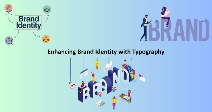
Aligning Fonts with Brand Personality
In an extension of the visual text characters of a brand personality and values, typography plays a major role. Playful, rounded fonts may communicate friendliness and approachability, while classics would evoke feelings of tradition, professionalism, or luxury. Designers translate those into tangible fonts that would speak with the core sound of the tagline of their site, as well as the nature and taste of the audience. For example, one would definitely consider using very modern, geometric fonts like Poppins or Nunito to appeal to Gen Z consumers for a fashion boutique, while another option might be beautiful serif fonts such as Playfair Display or Garamond to find their target market in a high-end jewelry store.
Keeping this uniform visual tone through channels and processes, from product pages to checkout forms, from confirmation emails to marketing banners, helps in creating a sense of brand recognition and trust. The fonts should thus form part of a style guide along with color palettes, images, and iconography. In the cut-throat world of e-commerce where trust plays a dominant role in lock or key in the hearts and trust formation within customers and where strong memories of the same type lead to repurchase, consistent as well as expressive text is not just plain decoration; rather, it is a strategic power at branding.
Using Font Pairing to Create Visual Harmony
E-commerce typography often carries the reputation of fabulous coming from the pairing of two or more complementary fonts. The norm would be that one font should serve for the headlines or display fonts-they are designed to catch the attention. The other font may be used for paragraphs and other detailed content, which are meant purely for clarity and ease of reading. The trick is to have a contrast-meets-cohesion balance. A good font combination is a decorative header font with neutral, easily readable sans serif body fonts.
Another example is creating a content-wise hierarchy by way of font pairing, such as for product specifications, reviews, and size guides. For instance, a bold slab-serif header could grab attention to product names, while a light sans-serif could deliver technical specifications. It keeps the visuals noisy and stresses-free and creates conviction in the decision. Poor pairings, however, create elements of friction and confusion. Well-thought-of typefaces do not only beautify; they also simplify and make easy the experience of online shoppers.
Optimizing Fonts for Speed and Performance
Choosing Fonts That Don’t Weigh Down Page Load
In reality, speed is an uncompromising aspect of an online store’s success. Even a single second delay in page load time loses a huge chunk of user engagement along with sales. Various factors contribute to overall page weight out of which the fonts having many different styles or weights are one of them. Designers and developers must be careful about choosing efficient fonts ideally lightweight and fully optimized and hosted on a fast global content delivery network (CDN).
Tools such as Google Fonts enable designers to trim font subsets so that only required styles (for example Regular and Bold), and to asynchronously embed fonts to minimize render-blocking as well. For example, developers can replace such strategies with other font-display strategies such as swap or fallback, whereby users get visible text immediately rather than waiting for fonts to load. For high-volume e-commerce websites having thousands of pages holding products, these tiny areas add up and lead to superior user experience and a better conversion rate.
Implementing Web Fonts Strategically
Not all fonts can be loaded at once. Loading only the fonts that are used above the fold, such as those in product headlines and navigation menus, can help developers make the perceived speed increased and reduce cumulative layout shifts. Such options as font preloading, browser caching, and compression through tools like WOFF2 format can perfectly boost font performance. These techniques allow early display of important content to keep users interested while loading background secondary fonts.
Fallback systems are crucial for this as well. If the custom font fails to load for a user’s browser or device, the system font most appropriate to the replaced font should have a clean and legible appearance. No more broken layouts and inaccessible critical content will remain for users. Strategic font implementation is a graft between aesthetics and engineering. There is an understanding that beauty alone does not constitute good typography, but the ability to function speedily and resiliently. In such an age of milliseconds counted, font optimization handling will separate the overachieving from the underperforming outlet.
Psychological Impact of Fonts on Buying Behavior
Evoking Trust Through Typography
Fonts have strong emotional significance on the audience and its impression about the content and the brand. A typeface chosen poorly can suggest unprofessionalism or inconsistency and lead to skepticism from the users—in particular, with some types of financial transactions. Contrarily, an elegant type in a cohesive way that fits with the ethos of the brand stands for authority, instilling trust. Serif fonts Georgia and Merriweather are said to be more traditional and credible, while Helvetica and Arial signify simplicity, modernity, and transparency.
Due consideration should, therefore, be afforded to the emotional impact of fonts as they come to reinforce the underlying message. Letters have to be clear, calm, and authoritative in sensitive areas such as payment gateways, return policy statements, or security badges; any other mismatched or stylized letter would raise doubts. A coherent font strategy that links product pages with their cart experience and even the help sections ensures that users, rather than feeling lost or cautious, feel welcome and respected. Typography-driven salesmanship can therefore discreetly draw customers over the finish line.
Creating Urgency and Encouraging Action
Urgent posting: urgent typing catches people by emotions. In headlines announcing limited time offers, flash sales, and countdown timers, the use of bold, high-contrast typefaces captures the attention while inducing a sense of urgency, while italics, caps, and garish color will more enhance the visual impact of that message for immediate action by the user.
With this approach too excessively, users can get tired or cease to trust whatever they read if the messages seem manipulative or misleading: too effective but not authentic. Call-to-action buttons, such as “Buy Now,” “Limited Offer,” or “Only a Few Left,” should not vary much in typography from the site’s overall visual language: this minor typographic prominence could be achieved, for example, by making it in a larger or bolder version of the primary font. When done correctly, urgency-based typography catches the subtlety of nudging the user toward a decision while enhancing conversions and protecting brand integrity.
Ensuring Accessibility Through Inclusive Typography
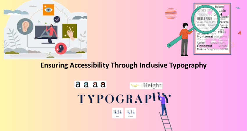
Meeting WCAG Standards with Font Choices
Accessibility is not purely a statutory provision; it seems to gain ground as an inclusive design attraction whereby people now go to your site and make use of its resources. The selection of fonts is vital in affirming a WCAG. Legibility and good letterforms should be on the forefront of a designer’s mind when choosing fonts: overly decorative or tightly spaced ones should be avoided for fear of impeding readability. Contrast between the text and background is crucial so that, regardless of having low vision or color blindness, the users can still see the content.
Sans-serif fonts like Verdana, Tahoma, and Source Sans Pro have been championed as good web typography for accessibility. Designers should also be cognizant that users are allowed to resize text to 200% with no issues to layout, breaking, or clipping. Accessible typography should work seamlessly with screen readers, keyboard navigation, and other assistive technologies. Overall, bake in the accessibility from day one so that every visitor, including those with temporary impairments like eye strain or glare from screen reflection, gets usability.
Designing for Users with Dyslexia and Visual Impairments
Although most designers consider aesthetics, in today’s world, they have to shove in mind the real users with special cognitive or visual challenges such as dyslexia. Fonts for dyslexic readers, for instance, like OpenDyslexic or Lexend, include heavier strokes at the bottom, and bigger character spacing in order to avoid confusion and to help the readers comprehend what they are reading. These types of fonts aren’t perfect for putting all over a website, but including them in an accessibility menu can help immensely with the experience of some users.
These two things, color contrast, and spacing can also play their important roles in making typography accessible for the users. One would also have to avoid light gray text on a white background and keep the line spacing consistent to prevent eye strain and confusion. Fully justified text would have to be avoided, and left-aligned, ragged-right paragraphs preferred in these cases. The effect of all this would be clear enough to read by those suffering from visual processing problems. It also goes against the belief that such things are going to compromise design aesthetics. Instead, it is about creating a web environment that is truly welcoming, usable, and empowering to all.
Conclusion
If you view your fonts as merely an ornament for visual aesthetics, then you would probably care less about the selection process. But even then, it would be a shallow surface because these data directly affect users in how they perceive your brand, read your content, or choose to buy it. The increasing consumer expectations on the technologies will then compel a designer, in this case, to assume a role where fonts are not only fit for the function of strategic resources but items of mere decoration in 2025. All decisions concerning type-whether it is regarding its legibility against branding alignment, performance optimization, and accessibility-have a direct effect on and implications for the entire shopping experience.
Fonts serve as a blend of art and utility-in essence, a bridge between brand communication and user needs. Designers that achieve harmony within these two directions will create experiences that combine aesthetics with user-friendliness, inclusivity, and practicality. In an age where time is scant and competition, plentiful, typography becomes an important arrow in the user experience quiver-where, if selected rightly, it will serve the purpose of achieving business objectives while enhancing client satisfaction at every digital touchpoint.