Introduction
Trust is one of the most preferred companions in the success of e-commerce in the digital commodity market. With thousands of online alternatives, users will part only with their sensitive information and hard-earned money when feeling completely secure. Among all the pages within the e-commerce website, perhaps the page with the highest impact on influencing users’ trust is the checkout page. It is the last step in the conversion funnel, and any hint or whiff of doubt or insecurity can turn users away, often just seconds away from finalizing their sale. It, therefore, becomes more useful than ever to ensure that trust-building strategies are included during checkout.
Evaluation of how the customers view credibility at the transaction level entails a little psychology and a little bit of design thinking, and a few of the hallmark tenets of technique. Bright UI elements to social proof; security seals to clear return policies-every aspect of this checkout process can either inspire trust or raise the red flag. It would be the survey of a myriad of trust-building tactics specific to checkout pages and aligned under proven UX principles and business logic. By the end of this, you would know exactly how to create a frictionless yet confidence-building experience for your users.
Clearly Display Security Assurances
Use Trust Badges, SSL Seals, and Payment Logos
Trust seals and badges are value symbols on the checkout page on which customers depend. They tell customers that the site concerned is well-educated in data protection. Seals like “Secured by Norton” or “McAfee Secure” or “Verified by Visa” convince customers that common and acceptable security measures are being practiced. These symbols are not just decoration; rather, studies have shown that they sway consumer behavior toward transaction completion. Therefore, a working SSL certificate must manifest in the URL of the server as a lock sign with “https://.” These subtle cues just affirm encryption and contribute to user confidence.
Adding logos of payment methods trusted by our users such as PayPal, MasterCard and Apple Pay can certainly enhance confidence levels. People feel more inclined to transact with platforms that they trust; by showing these logos at checkout, you provide an impression of secure transaction quality within your store. Place these logos next to the payment input, an area of the checkout form that customers will notice right before making their decision. A host of trust marks creates a “layered assurance effect,” adding to the comfort and reducing doubts of the user while checking out.
Be Transparent About Data Usage and Privacy Policies
Modern consumers have ever-growing concerns about their data use, particularly as it relates to financial and personal information. Providing accessible, clear, and concise privacy policy links right next to the checkout form can build consumer trust. Users will be more inclined to process their transaction if they find that your site is serious about privacy and willing to explain how data will be used. A well-written privacy policy need not be verbose; it should simply state the collection, manner in which the information is stored, and articulate whether it will be disclosed to third parties.
Further, small tooltips or messages near sensitive data form fields could be highly beneficial. For example, the phrase “Your data is encrypted and never stored on our servers” next to the credit card input area would provide incredible reassurance. This kind of micro-assurance, which integrates into the checkout flow, reflects that you took the time to think about security and have the intent of protecting your users. Users tend to trust brands that are open and transparent, and this can lead to a higher conversion rate.
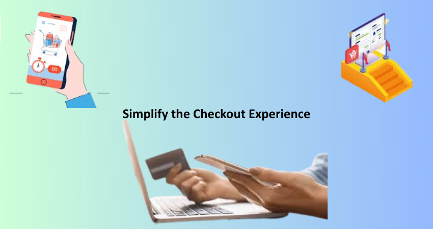
Simplify the Checkout Experience
Remove Unnecessary Fields and Distractions
Distrust can rapidly take hold of a cluttered or overly complicated checkout page. Consumers expect a rapid, intuitive, and distraction-free purchasing venture. One good way to enable this is by removing entire extra fields that do not really serve a function in the transaction. Every objection field adds friction, increases cognitive load, and allows users more chances to re-evaluate their purchasing decision. Studies show that a simpler form will convert better, and in the case of checkout, this will also engender greater perceived trust.
Whenever the upsell banners, pop-ups, or suggestions of unrelated products distract the user’s checkout journey, they risk being labeled as aggressive and pushy and thus turn users off. It is tempting to use the space for an average order-value-upgrade – but not here! Instead, create a streamlined layout where the customer focuses on entering their information and completing the order. A minimal design with plenty of white space and steps marked clearly to enhance clarity exudes professionalism, both of which are crucial in establishing trust.
Implement Guest Checkout and Autofill Options
Forcing users to create an account before making a purchase is a common trust killer. Mandatory registration creates a perception of spam, privacy issues, or simply a hassle. All these reasons cause customers to abandon the transaction altogether. Enabling guest checkout increases conversions sharply, especially for new customers who have not formed any relationship with your brand. Make it very clear that it is okay not to create an account, and explain its advantages — such as order tracking — without it coming across as a requirement.
It is also great to speed up the process and reassure users by including autofill features and payments through Google Pay or Apple Pay. These are not only time-savers but also help in reducing errors — a source of utter frustration for users. Autofill works by using browser-stored data and previously saved customer information in a way that creates an integrated experience in which trust is built by minimizing manual work. Guest checkout and autofill thus convey a message that the company respects users’ time and cares about minimizing friction for them.
Provide Social Proof and Customer Reassurance
Highlight Reviews and Testimonials Near Checkout
The principles of social proof are strong triggers of persuasion in a psychological sense. Showing customer reviews, rating feedback, and testimonials in close proximity to the checkout section will make procrastinating buyers feel more reassured that others had good experiences too. When these somewhat indecisive shoppers observe other real-life people purchasing and enjoying this offering-their decision is justified! Verified reviews with timestamps, customer photos, and video testimonials add to the sense of authenticity. Creating a sidebar to showcase this feedback near the purchased items’ summary gives an instant boost of confidence.
Alternate considerations could include the issuing of instantaneous messages: “Somebody just bought this in New York!” or, “This product currently has 32 viewers!” These messages embody the notion of FOMO (fear of missing out) and build excitement around your store. When shoppers witness others actively participating in buying and trusting your brand, they become encouraged by the herd mentality to do just that. But beware, going overboard may draw undue attention, while excessive fake-looking notifications may seem too cheesy and backfire.
Display Clear Return and Refund Policies
Another important contributor to trust in the mind of a shopper at the time of checkout is the clarity and visibility of your return and refund policies. Shoppers require confidence that some form of security will be afforded to them in case something goes wrong. Hiding your return policy behind layers of navigation, or saying it in a language far too legal can actually breed suspicion and thus become a detriment toward making sales. Thus, it would help to have it linked clearly or preferably summarized in a few sentences near the checkout button. Phrases like “30-day hassle-free returns” or “100% satisfaction guaranteed” go a long way.
Bulleted statements or short blurbs should highlight key aspects of your policy: how many days a customer has to return an item, any conditions attached, and how refunds proceed. If digital goods are concerned, then include your views concerning downloads and licensing. In showing all this information beforehand, you show that your brand believes in its products and respects customers’ rights. It inspires long-lasting trust on the part of the customer, lessens the anxiety of pre-purchase, and in turn can minimize post-sale disputes and chargebacks.
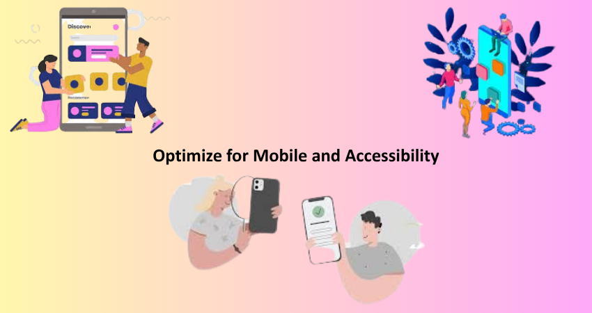
Optimize for Mobile and Accessibility
Design a Mobile-First, Responsive Checkout
More than half of all online shopping activity occurs on a mobile device; thus, it is absolutely necessary for the checkout page to be set up with small screens in mind. A mobile-first design ensures users can enter their information without pinching, zooming, or juggling misaligned form fields. Layout elements should stack vertically, and buttons should be large enough to be tapped without false clicks. A mobile checkout page that does not work well is a fast erosion of trust since it indicates a less concern for user experience.
In addition, consider mobile-specific features like mobile wallets (Apple Pay and Google Pay), fingerprint payment, and camera card scanning. These are all tools that save time but also make the user feel more secure utilizing features native to their mobile which they know and trust. Just remember that slow load times, script errors, and UI glitches are all magnified on mobile devices; thus, make sure to test thoroughly and often. Mobile optimization is not just about comfort; it impacts whether the mobile user has the confidence to buy from you.
Make Accessibility a Priority for All Users
Universal trust, however, trust also includes. Hence, ableism is one key part of establishing credibility for the site owners. With features such as screen reader compatibility, keyboard usability, colors with contrast, and properly labeled forms, such common means become not only ethical design practices but also a must legally in many lands. To stress these are very important with an Accessibility Statement, you care about every visitor’s journey, deepening the level of trust.
Those who possess some form of assistive technology are likely to abandon carts in a more frustrating or unfinished checkout experience. Things barely visible to the eye, like unlabeled form inputs, can create major obstacles. Added support would come from error messages, increasing the size of fonts, and minimizing flashing elements. An interface designed with accessibility in mind would create a trustworthy user experience. This builds wider horizons for your potential customers while also portraying professionalism and reliability for your business.
Conclusion
Trust precedes all online transactions, and no point is more important than at the checkout page. This final frontier between customer and complete sale must be built artistically, with such strong instruments to include confidence, reduce friction, and offer maximum reassurance. Displaying security badges and simplifying checkout processes, refund policies optimized for mobile and accessibility, each factor in nurturing such a trust. Even a small issue that’s not coped with could mean losing a sale. In contrast, though, a well-thought-out design approach that dwells on trust could boost conversion levels and customer loyalty enormously.
In such a competitive e-commerce environment, your checkout page has become a litmus test for your brand’s credibility and, while serving as a functional endpoint, is also more than that. From this article, the strategies described reduce cart abandonment and create long-lasting relationships with customers. When the people feel secure in the process, supported, and respected, they will return over and over again — and tell other people. Trust turns visitors into customers, and customers into brand advocates.