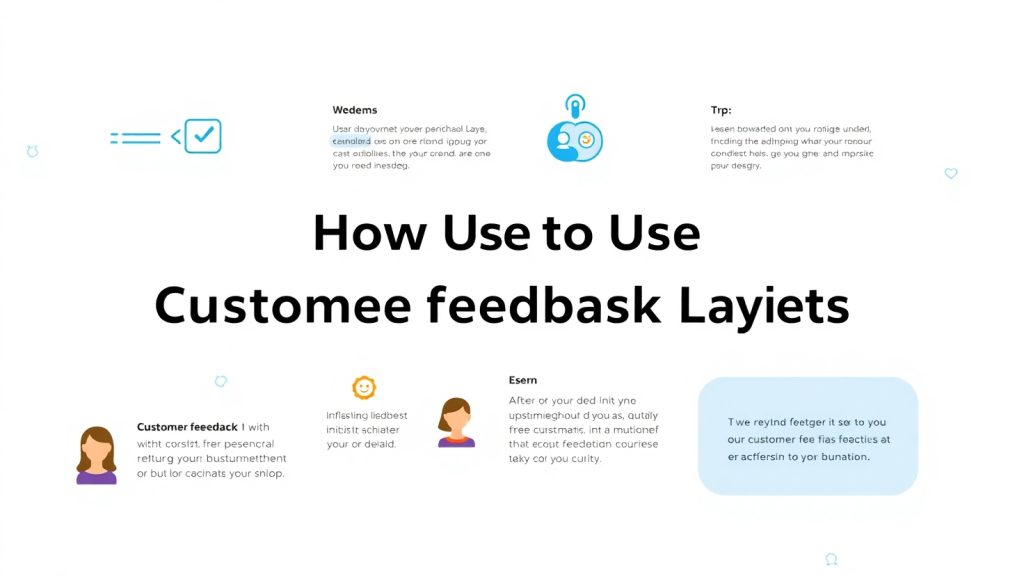
Why Customer Feedback Matters in Conversion Optimization
Customer opinion is one of the greatest, yet underutilized tools, by many of them in increasing Conversion optimization rates. When customer talks about his views through surveys, reviews, or even direct comments, he tends to show direct raw insight into what works and what does not. For digital businesses, they would walk through this feedback on how to optimize experiences, reduce friction, and build better relationships with users.
But why does it matter to conversions? Because when a consumer influences changes in parts of the environment — like layout, navigation, or copy — based on real users’ input, it creates an environment closer aligned with what audience expects. Such comfort and clarity make it easier for your visitors to complete the actions that matter to you, whether that’s making a purchase, signing up for a newsletter, or booking a service.
Another reason to use customer feedback is emotional validation; users trust becomes increased when they see improvements made by their grievance voice. Such trust leads to high user retention and positive word-of-mouth recommendations -later important to the company’s growth.
In an age when user experience decides success and failure, listening and responding to what users have to say is no longer voluntary; it is necessity.
Now we can start to build out the exact ways to structure that feedback into layouts that look and feel good without losing them into some lost numbers.
.
Types of Feedback That Can Shape Your Layout Design
Not all feedback is of a similar kind. Some might just be vague comments, such as, “The site is too slow,” while the others tell one exactly what it is that they had in mind to such an extent, such as, “The ‘Buy Now’ button is too far down the page.” Organizing your layout with these considerations in your board needs categorization in the way these insights fall.
Four types of feedback can generally be attractive points for design: these are usability, emotional tone, appearance, and content clarity. Usability feedback is usually seen on an application’s navigation aspects, button placements for certain actions, and often it includes references to how fast the page loads. Emotional tone is what tells you how a user feels while experiencing your site within its browser-will it be soothing and fun, frustrating, or confusing? Visual appeal concerns color schemes, spacing layouts, and font choices. Finally, content clarity concerns whether your message comes through clear and convincing.
Collate them according to these categories when you have collected that information, whether through exit surveys, heatmaps, or interviews. You would then be able to prioritize which areas needed some design overhaul. For instance, if multiple users say they couldn’t find the FAQ section, that’s a signal for accessibility or navigation layout.
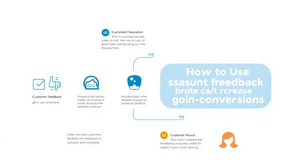
How to Collect Actionable Customer Feedback
Feedback collection is more than just a simple survey. True, honest, and specific actionable feedback means that you have to ask the right questions and in the right way. Clearly define what type of feedback you would want. Do you want to test a landing page? Is it from checkout shakes? Tailor your questions to that specific purpose. For example, “What would you like to find on our home page but couldn’t?” instead of “What do you think about our homepage?” Timing is also an issue. Feedback after the event of purchase or session chat tends to be richer because the experience is still fresh in mind. On-site surveys with tools like Qualaroo or Hotjar will allow you to query consumers as they browse your site for more location-specific answers.
It is also good to use various channels. Email follow-ups, social media polls, and even customer support tickets can all provide useful insights. Don’t forget to check reviews on other sites, such as Google or Trustpilot; those are just waiting to be opened and provide you with treasure troves of intelligence. Analyze it for repeating themes once you have gathered the data. If five people say that the navigation is confusing, it warrants investigation. Use tagging systems or apps for sentiment analysis to quickly organize feedback and identify trends.
When you have the right data collected at the right time, your design team has something real to work on when you gather direct insight on what your users actually need.
Using Feedback Loops to Validate Layout Changes
Feedback loops help in being agile and not only collecting feedback but actually applying and iterating through feedbacks. Think of a feedback loop: you collect data or insights, you change something, and then you ask people what they think of your change. By this example, one can envision a feedback loop that could be especially great at layout design, where small changes can radically change user behavior.
It’s very important to set your metrics from the start. For example, you repositioned a CTA button according to user input; how are you going to measure that its success? Use A/B testing tools categorized in either click-through rates or scroll depth heatmaps to see if user engagements are different whatsoever.
After trying out changes, go back to the users one more time through another survey, or better yet, conduct personalized interviews. Ask whether the layout feels more intuitive or whether they were able to find what they needed more easily. This fine-tunes the design further and strengthens the relationship you have created with the participants.
Another factor will be documenting every loop. Will need a record of what will change for what reason. This creates a veritable knowledge base that helps your design and UX teams make informed decisions in future updates.
Remember, Website layout design is not always about “set it and forget it.” There are maintenance procedures and feedback loops in place to continuously adapt your website to the needs of your audience.
Best Layout Elements for Showcasing Customer Feedback
Taking a direct approach toward the customer’s feedback is one of the smartest ways to utilize them right into your layout. Be it testimony or ratings; place strategically to build the credibility of your flow toward conversion.
By placing a testimonial near a call-to-action, it becomes social proof. It answers doubts right at that moment that someone else had a positive experience; user-generated content adds authenticity, like product reviews with pictures for visitors to make decisions confidently.
Layout matters here. Clean, minimalistic sections with abundant white space ensure that the feedback does not look cluttered. Carousel sliders are used for viewing the plethora of testimonials, while “before and after” layouts could portray the change your product or service has brought about.
In a service-based website, actual snippets of testimonials can be placed against the relevant service description: for eCommerce, incorporate star ratings and short reviews into the titles of products. And to make it human, add author names and profile images where applicable.
Another tip is not to cherry-pick the most positive feedback. A mix of testimonials, including some mild criticism with responses, shows transparency and helps to build trust.
In this case, any of these layouts would not just become background noise but rather, a compelling design component that will push it through directly into conversions.
Integrating Feedback Seamlessly into UX and UI
The integration of customer feedback into your layout should seem natural rather than forced. This means integrating it into the user journey in a way that supports it instead of distracting from it. Therefore, it becomes important to deliberately choose where to place feedback and what tone to set.
First comes the UX. Think through what path a user takes through your website. Where might feedback help reassure them or clarify their mindset? Just before the point of decision-making—a sign up, a checkout, or a form fill out—it’s where feedback could go.
In UI terms, have the design sit well within the general visual language of your site. In other words, if they are soft colors with rounded shapes, then produce that same effect for the testimonial boxes. For a product involved with heavy data, consider more corporate styles, like chart or card quote blocks.
Also, have elements of feedback animated in a nice subtle way—such as a fading testimonial that comes in as users scroll down the page. Those kinds of animations give that little extra engagement without taking away from the experience.
Feedback integration does not end with text. You can use video testimonials, snippets of audio, or clickable star ratings. All of these enhance engagement and increase credibility.
If done right, it should feel like a conversation and not hard selling—which would indicate that the design is working with the user and not just for the user.
Conclusion
A customer’s say is more than an opinion—it is a blueprint. It is structured layout-wise to plant trust, answer objections, and push users toward taking action effortlessly. Feedback could come from surveys, reviews, or usability tests; the real value of this feedback lies in putting it into the design changes that reflect what your users truly intend. With careful implementation and ongoing feedback loops, you could create a website conversion machine powered by your customers’ voices.