Introduction
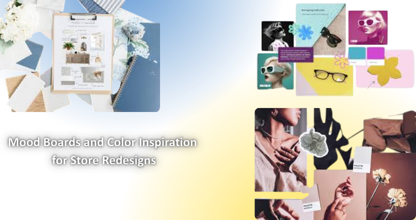
Redesigning a store involves more than just relaying products or moving shelves. In fact, a successful store redesign is capable of delivering a visual emotional experience to its potential customers. A mood board and color palette are basic tools in a creative process to visually define the new aesthetic of the brand. It collects and organizes design inspirations, textures, colors, and other elements into one coherent direction as the basis for all design decisions. This design direction gives an overview for crafting a visually-appealing yet emotionally stirring environment for both digital and physical stores.
Mood boards enhance the communication between the designer, marketeer, and proprietor. By providing a common vision through images, typography, texture, and pattern, the mood board creates a shared basis for understanding the goals of the particular redesign being pursued. This visual alignment ensures that branding is cohesive across all touchpoints and helps avoid any miscommunication. The artistic guidance provided by mood boards and their selection of color schemes can ensure that everything within the context of the redesign-from wall art to products displayed-expresses the required emotional effect.
The Importance of Mood Boards in Store Redesigns
Aligning Creative Vision
The design ideas are brought to life and visualized through mood boards. They are curated snapshots of the mood, tone, and aesthetics that go along with the particular project. They become an integral part of store redesigns because retail must communicate a brand’s values clearly and immediately. The mood board condenses ethereal thoughts into recognizable visual representations that are easier to communicate and talk about. Compiling these images gives designers access to textures, typography, lighting types, and sample materials to communicate their aesthetic direction concretely even before the first physical change is made.
This kind of alignment is necessary for collaboration within the team. Stakeholders, including brand managers, interior designers, and marketing professionals, will all weigh in on the mood board to ensure that everyone is working toward the same creative goals. A mood board thus guarantees that whether creating an intimate boutique or a buzz-heavy tech shop, all design decisions flow from one visual language. Without a mood board to unify the intentions, designers may get into a situation of inconsistent execution that will confuse customers while diluting the brand’s message strength.
Reducing Costly Revisions
The greatest utility of mood boarding lies in the fact that it can reduce amendments on costly designs. Mood boards set a sensible visual direction early in the redesign to create a reference point for material selections of colors and lighting options, besides layout decisions. Therefore, they make things easy for designers and stakeholders to assess the inclusion of a new element in terms of the overall concept; thus, it avoids back and forth on making such adjustments.
These do not only save time but also money because, in physical stores, redesign processes involve heavy investment into construction, furniture, and doping. Changes at this stage mostly lead to overbudgeting and time delays. A mood board can be viewed as the roadmap for teams to avoid potential missteps and to ensure that all of their decisions support the original vision. This structured approach would bring peace of mind to business owners and create more predictable outcomes.
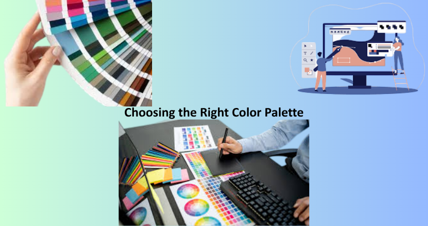
Choosing the Right Color Palette
Psychology of Color in Retail Design
Colors nourish emotions, behaviors, and perception; thus, it can easily be said that color is an effective weapon in store design. Every color affects the psyche: red makes you feel alive and hurried, blue inspires trust and calmness, green is mostly associated with health and sustainability. Understanding this psychology in color allows retailers to work on creating spaces that can spark certain moods, in line with their very own brand identity objectives and customer experience goals.
The choice of colors in retail must relate to the type of store and what kind of customer he or she is targeting. A good example is a luxury boutique that might combine neutral tones like black, gray, and gold to represent elegance and sophistication, while a toy store can dabble in bright primary colors in order to illustrate joy and fun. With the application of color psychology, designers now have the power to control customer behavior, influence time spent in the store, and provide truly memorable shopping journeys.
Harmonizing Brand and Environment
Choosing a color palette is not only about aesthetics; it aligns all visual elements relaying one’s brand values. An aura that is cohesive creates an immersive environment reflecting the brand’s personality and improves recall among customers. For example, an eco-friendly brand may include color tones such as the entire palette of green to brown earth tones as a representation of sustainability, while high technology brands are likely to attract some bold, high-contrast colors such as electric blue paired with black to make space feel innovatively new.
Consistency in utilizing color palettes across a store is everything. Wall colors, signage, and even product displays and lighting should touch on a strategic color theme. So, with all that, the customers are sure going to have a unified experience. It will also create stronger emotional connections with the brand. Wise and consistent color usage makes a brand more genic and intuitive, more beautiful, and easier to navigate through shopping space.
Creating an Effective Mood Board
Gathering Visual Inspiration
Initially, we need to gather all our visual input for the mood board: photos, magazine clippings, fabric samples, even a Pinterest board, and brand imagery. All of those are potential funders. As for the designers, it should be an ecstatic collection of essentially sorrowful design works for the new store. Sets the stage for another consideration of a variety of factors-internal and external, including lighting, layout, textures, product presentation, and signage-who together form a comprehensive view of the entire envisioned aesthetic.
Setting up a more structured and professional board is possible by using digital tools such as Canva, Milanote, and Adobe Express. It is capable of simple drag and drop into a flexible layout, with abundant opportunities to try out different mixes and arrangements. As they keep adding on elements, they see emerging patterns or themes guiding the design direction. A little ingenuity and strategic thinking pave the way for establishing design decisions while keeping the imagination alive.
Curating for Consistency and Focus
The refining and editorializing phase comes after gathering a broader array of references. A powerful mood board should not contain everything; it should rather be focused and targeted. Every element in consideration should be argued, and anything that does not seem to support the desired aesthetic should be thrown out. The aim should be to distill the collection into a visually cohesive map that tells one story that looks appealing.
At this stage, think about how each element works on the overall theme. Are the colors consistent? Is the typography and imagery feeling right? Think of the presentation when it goes together: Does a narrative emerge? Also useful would be to categorize the variables, i.e., swatches in one corner, textures in another, and examples of layouts in a group of three. Such grouping improves clarity and helps convey ideas into the minds of the prospective stakeholders or clients!
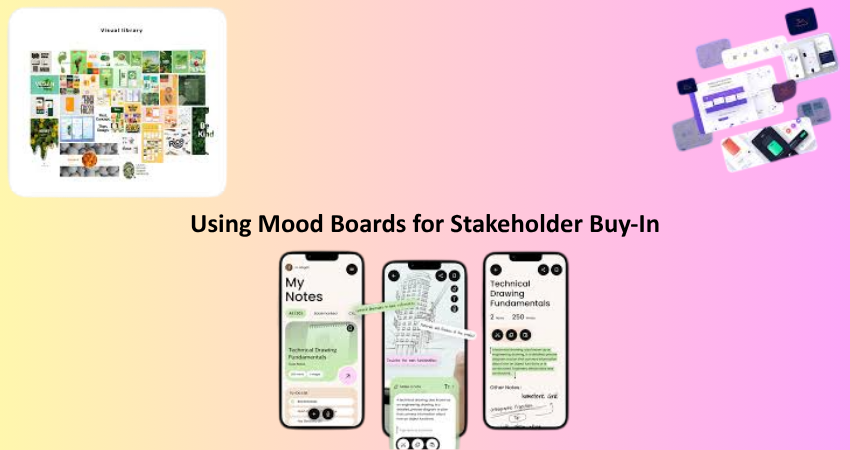
Using Mood Boards for Stakeholder Buy-In
Presenting the Concept with Confidence
It is fair to say that mood boards are not only internal tools, but presentation materials as well. Upon presentation of the store design, a mood board creates a very clear visual preview for business owners, managers, and investors. Designers can use the concrete examples and imagery within the mood board to point out specific elements and details in their design vision, thereby avoiding limiting themselves to verbal explanations, vague concepts, or interpretations.
A really good mood board presentation must tell a story. Begin with the brand goals and show how each element you have on the board supports those goals. Discuss color choices, material selections, and interpretation of layout as they pertain to consumer experiences and brand alignment. This method builds confidence for stakeholders and aligns their interests in the design decisions, therefore heightening the possibility of approval and success of the project.
Facilitating Feedback and Collaboration
Each goes according to how a mood board is defined; hence collaboration is another benefit. Stakeholders will usually have something valuable to contribute: brand history, customer behavior, operational needs, and so on. When the designers present a visual draft of the redesign early on, they can collect feedback and make adjustments to the concept before significant resources are spent. This creates a feedback loop wherein stakeholders feel they were heard, and they feel that they contributed something to the final result.
Mood board tools can encourage the addition of comments, maintain version control, and support real-time collaboration, all of which result in a fast tracking of the review process. When opinions are collated at this point, then adjustments are easily made to the concepts, which eliminates possible misunderstandings later on. This collaborative approach will build both trust in the designers and confidence from stakeholders that will enhance a team’s group atmosphere, which benefits the redesign initiative.
Conclusion
As a mood board, carefully curated color palettes must have unquestionably become part of the arsenal required for store redesigning. Once again, conceptual visualization can bring them together or realign them, help in steering the creative process, and reduce costly mistakes. By understanding the psychology of color, mood boarding it, gathering and refining visual inspiration, and presenting ideas effectively, designers are actually making it more impactful and strategic for the retail into such environments.
If you’re going for enhancing a boutique, creating a new flagship site, or transitioning to a new design for an old space, these are structural tools for your creative processing and steamlining. Spending time building mood boards and choosing color schemes is by no means just about design; it is putting solid underpinnings into train for why the store will resonate with customers, express its brand identity, and, in the end, effectually help with business.