Introduction
The burgeoning realm of e-commerce undergoes fast changes, which is why UI design is the funnel through which people engage with online stores. Businesses have put pressure on developing interfaces that work seamlessly, entice, and intuitively speak to honest exploration and maximize conversion as consumer expectations rise. A good UI does not just mean that it looks good- it facilitates an overall shopping experience that fills minimal friction and allows the user to take important actions. Very important actions such as adding an item to the cart, reviewing or checking out.
The UI trends for 2025 in e-commerce are based on personalization, performance, and human-centered design. The distinction between aesthetics and usability has diminished, and well-performing e-commerce brands are adopting UI best practices by prioritizing speed, clarity, and trust. With lowered entry barriers, staying in the know about UI trends has become a necessity rather than an option toward relevance and customer retention. In this article, we will discuss the best e-commerce UI trends and how you can implement them in your store to get results.
Minimalism and Visual Clarity
Clean Layouts That Emphasize Products
Minimalist UI is a strong power in different fields, but especially strong in e-commerce because it leaves no space for distractions and pinpoints rather than directing the user’s attention: the product-in images, commands, and even white space perfectly. Those large open areas purposely welcome the eyes to images and calls to action without having to pull anything away. With all of that simplicity, the users were able to either directly or by instinct engage in easy navigation with less cognitive load but more use. Take, for instance, successful brands such as Apple, Everlane, and MUJI—each design detail is deliberate and facilitates a smoother journey through the shopping experience.
Minimalism also improves load times and performance; fewer graphics and clearer code mean a lower page weight-and serves well for fast-loading pages that can keep bounce rates low. Since mobile usage dominates online shopping, a minimal interface adapts more seamlessly to small screens, ensuring a consistent experience across devices. Boredom is not the objective; intention is. A well-implemented minimalist UI uses typographic choices, contrast, and hierarchy to smoothly move users through the funnel. In all these cases, the name of the game is clarity- if users are confused or overwhelmed, they will not convert.
Strategic Use of Typography and Icons
Now, UI typography becomes symbols of brand identity and applicability, guiding users through providing visual balance, thus becoming more than mere text. Use of large headings with readable body fonts and treatment of type in bold strokes that create emphasis and structure in e-commerce. Today’s designers now adopt variable fonts and type scales to achieve responsive readability across devices without complying with varying designs. In short, product descriptions, filter menus, and checkout pages are some instances of places that need legibility-by-texts, because more than ever, nowadays users rely on texts for decision-making.
The application of icons is equally important and complementary to minimal modern UIs. From shopping carts to category filters, the recognition is instantaneous without using any language; hence, it becomes apt for a global audience. Of course, it is a matter of being consistent and thus simple. Icons must be those which could be known universally and stylistically aligned with that of the brand. Feedback through hover-senses or tool tips could be used to provide context, thus ruling out users from guessing. Typography and iconography, thus, join hands to shape this clean e-commerce interface-a navigable space where products take the center stage, and interaction becomes second nature-to them.
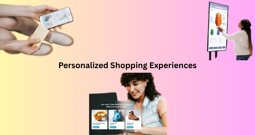
Personalized Shopping Experiences
Dynamic Content and Smart Product Suggestions
One of the strongest emerging UI trends that keep customers engaged in an e-commerce store today is personalization. Shoppers now expect a certain technology that can dynamically change based on their behaviors, preferences, and buying history. It’s somewhat more than just showing “related items”; it’s about curating a browsing experience that feels almost unique to every other visitor. Personalized content can include geographically relevant related products, items viewed by the customer before, or AI recommendations borne out of behavioral data. These features are now becoming standard for the larger platforms like Amazon or even stores using Shopify power, and they’ve proven to contribute greatly to better conversion rates.
UI is very crucial to create this seamless feel of personalization. Recommended items should feel like an integral part of browsing and should not feel imposed. The use of components such as carousels, expandable sections, and filters should help users interact with suggestions easily. A well-implemented personalization UI could lessen decision fatigue and afford an easy purchasing journey. This increases user satisfaction since it shows that the store “knows” its customers. Without such a dynamic personalization UI layer, retailers may find themselves out of the race in an arena that demands relevance.
Customizable Interfaces and User Profiles
Another trend on the rise is giving perspective users power over their own shopping interface. Customizable UIs-where users can filter, sort, or adjust the layout of how products appear-are being adopted by progressive e-commerce brands to enhance user satisfaction. User-for example, grid versus list view, favorite categories, and sizing preferences-can go a long way toward improving usability of the site. These small features create a sense of ownership and alleviate friction in subsequent interaction.
The more advanced examples are organizing user profiles into central personalization hubs. Returning users will see a personalized dashboard with purchase history, loyalty rewards, saved items, and preferences on one page. The UI designs evoke the explicit and intuitive features in a manner that instills continuity and faith in the users. When the users think that time and preferences are taken into consideration, they feel highly incentivized to return for subsequent purchases. Personalization, as understood under a roof, constructs an entire UI Principle on empathy and personalization, thereby paving the way for a more human-based shopping experience.
Mobile-First and Thumb-Friendly Navigation
Responsive Design with Mobile-Optimized UI Patterns
With over 70% of e-commerce traffic coming from mobile devices, being mobile-friendly is no longer enough; now, it has to be mobile-first. This usually starts with the smallest possible screen, adding features and content as you go larger, ensuring that essential functions like navigation, search, and checkout are easy to use on a smartphone. UI trends include collapsible menus, the so-called hamburger menus; they include sticky header navigation with bottom anchors and full-width CTAs. The elements get placed in thumb-accessibility and mobile gestures.
More complex UI patterns, such as product carousels for galleries, swipeable tabs for category browsing, and expandable accordions for product details, enable usage in a natural manner, doing away with pinching and zooming on the screen being viewed. Timing for loading a page or the visual clarity also emphasizes that it need be given equal importance. A mobile-first interface exemplified by terra incognita is sleek and simple to push away all desktop distractions and focus upon fast search, easy browsing, and simple purchasing. Correctly functional, mobile-first interfaces get you more customers, lose fewer to the cart, and have retained customers through generations, especially among the younger population, where mobile becomes a primary shopping experience.
Seamless Checkout and Payment Interfaces
So checkout UI is really one of the biggest dealbreakers as a touchpoint in e-commerce. The longer and more complicated mobile checkout UIs can be, the more the abandonment rate. Trends are moving to seamless single-page or progressive checkout interfaces, guiding users through step-by-step processes and fields either hidden or hardly visible. Autofill, address suggestions, guest checkout, include necessary options to let someone complete a transaction with very little friction.
Payment integration is another mobile user interface consideration. Offering these payment options such as Apple Pay, Google Pay, PayPal, and Buy Now Pay Later (BNPL) services like Klarna to improve trust and allow access to the marketplace are all part of that. Featuring lucid icons and leaving intuitive placements and easy-to-select options would complete the payment experience. In addition, real-time validation (e.g., checking for invalid credit card numbers) and reassuring microcopy (e.g., “You won’t be charged yet”) go a long way in reducing anxiety for the user. These patterns of UI transform what was previously a painful point into a conversion-optimizing device because it enhances the user’s confidence and reduces cognitive load at that most crucial stage in the funnel.
Visual Storytelling and Immersive Media
High-Quality Imagery and Video Integration
As buyers cannot touch or try the product, the user interface has to create immersive experiences that satisfy instore sensations. Hence, the enormous use of high-resolution images, 3D product views, and embedded videos in e-commerce UIs. Brands are leveraging full-screen product images, zoom-in functions, and user-controlled 360-degree views for a more confident purchase. These pictures, obviously, are not devoid of aesthetics; in fact, they can provide a consumer with information to make favorable judgments about them.
At present, video is also part of modern-day UI, such as product demos, unboxing shares, and explaining animations. As part of the different websites, videos can be found on product pages, landing pages, and in autoplay hero section images. As a basis for UI design, however, video use must be well thought out: for example, videos have to be lightweight, mobile-optimized, and not auto-play with sound; controls should be intuitive; and the thumbnail should have clear signals of what the contents of the video are. If this visual storytelling is up for the taking, it helps deepen engagement with the user, trust, and shoppers come to more informed decisions faster, leading to satisfaction and lower return rates.
Microinteractions and Scroll-Based Animation
Microinteractions and scrolling-triggered animations make up another significant UI trend changing how people interact with e-commerce sites. Microinteractions are small functional animations that provide users feedback: a heart beats when an item is favored, a loading spinner appears as a filter is applied, and a mini-cart appears to change in real-time. These less significant details make a touchscreen UI more tactile and increase the easy acceptance to do interactive tasks by valued users.
Scroll animations animate the browsing experience and bring life into it. Product images fade in while hero banners slide in through parallax effects. And while this is occurring, testimonials lazily load into place, keeping distractions in sight and engaging the visual interest. They aid storytelling as they develop content slowly, not all at once. Less is more here: too many animations slow performance; distraction from the primary goal becomes imminent. Thoughtfully applied, these UI enhancements will generate emotional nudges, lower cognitive load, and facilitate an easy and pleasurable shopping experience online.
Trust Signals and Transparent Design
User Reviews, Ratings and Social Proof Integration
In this digitalized world of shopping, trust is everything-and that’s where UI indicates its role prominently. One of the key UI principles for gaining trust is the use of customer reviews and ratings. The latest trend is to publish positive customer reviews conspicuously, usually in the middle of a product page, using a combination of star ratings and snippets of reviews along with user-provided images. The placement of these elements should be simple, trustworthy, and accessible, with filters permitting customers to sort out reviews by date, rating, or relevance.
Social proof, such as “X people are viewing this now” or “John from NY just purchased,” gives a sense of urgency and puts people at ease. Other UI elements carry trust badges such as “30-day return policy” or “Secure checkout,” visibility of specific shipping policies, and clickable customer services. Such UI designs are not merely decorative. They impede any hesitant practice, encourage some degree of loyalty toward a brand, and significantly add to the number of conversions by removing mental obstacles that usually come into the picture when any customer even thinks of shopping on the web.
Transparent Pricing and Clear Product Information
While confusing or misleading UI can break trust instantaneously, another crucial trend in e-commerce UIs is transparency, particularly with respect to pricing, shipping, and return policies. Customers assume that all relevant costs, including taxes and shipping fees, will be shown upfront, and UI designs now move such information into an easily viewable screen, either immediately beneath the price or within a collapsible section on the product page. In fact, hidden charges or ghost promotions such as discounts (“15% off with code SAVE15”) should not be held above ground-but eliminated altogether to avoid customer disappointment at the time of checkout.
The design of the product pages should draw upon a kind of structured information that is easily scannable as well. Such information should cover anything from specifications, materials, and sizing guides, to care instructions. Simply applying some tabs or accordions for that material and tooltips lets curious buyers deep-dive but headlines strike a good balance by not flooding the entire UI screen. Other trending UI designing techniques are allowing visual comparison and integrating FAQs so customers can feel knowledgeable without actually going away from the page. An easy-to-understand and well-structured UI clears away the barriers of trust and builds up the confidence of the buyers regarding their purchases.
Conclusion
E-commerce UI implies not only how the website is designed, but how it actually performs, functions, and makes users feel. The hottest user interface trends of the year 2025 focus on clarity, personalization, performance, and trust. Whether through minimalism, smart personalization, mobile-first navigation, immersive media, or transparent pricing, these UI elements have been shaping the digital shopping experience for customers and thus converting.
In wise hands, the implementation of these trends will mean creating interfaces that are equally beautiful and genuinely workable. UI should be an interface to guide users, lessen friction, and delight them in meaningful little ways. With increasing competition within the e-commerce arena, it is the ones who invest in clever human-centered design that will find themselves able to earn repeat purchases and build scalable success. The trends are here; they work, and the thoughtful application of same will transform your e-commerce presence into a brand growth engine.