
Introduction
In the digital-first world we find ourselves in today, an e-store is not merely a good-to-have option; it is a necessity. But just setting up your e-commerce stall isn’t enough. If your online store isn’t accessible to everyone, then you are proactively keeping out a significant pool of potential customers. Accessibility stands for the design and development of websites so that people with disabilities such as impairments in sight, hearing, motor function, and cognition may use them as easily as others. With over more than one billion people in the world living with disabilities, making an e-commerce store accessible is both a legal duty in some or most places and also a moral one.
An online store that is accessible means that all customers are able to locate, browse, and purchase products without any hindrances. Examples of accessibility are screen reader compatibility, keyboard navigation, color contrast, text alternatives for images, and various other aspects that affect one facet of a user’s experience with your site. Moreover, accessible designs not only take care of the users with disabilities; it is an additional plus that helps all the rest by improving usability, responsiveness, and mobile friendliness. To some, the world of accessibility might seem daunting- however, the silver lining is that even the simplest of changes may bring about a world of difference. This manual shall guide you through the principles, pragmatic approach, and best practices for establishing a truly inclusive and accessible e-commerce experience.
Understanding Web Accessibility Basics
What Is Web Accessibility and Why It Matters?
Web accessibility means that websites and digital content should be usable by everyone: by all means, possible with having any barriers caused by abilities and disabilities. It implies adequate screen reader access and smooth navigation on your part of the website for users with partial vision disability, easy keyboard operation for users with limited mobility, and comprehension and interaction interface for users with cognitive disorders. Instead of being another type of web design, accessibility is a core principle that allows every user experience to be inclusive. In a nutshell, it encapsulates the idea of breaking down barriers and ensuring digital equality for every user.
There is greater importance to web accessibility above just moral and ethical considerations. In many parts of the world, such as the United States (ADA), the UK (Equality Act), and Europe (EN 301 549), there are laws which specifically require businesses to make their sites digitally accessible. Failure to comply with these could lead to lawsuits, fines, and reputational damages. Yet, there is also a business case such as accessible websites improve SEO traffic increase, bounce rates and overall usability. When your products are relatively easier to find, navigate through categories, and make purchases without frustration, then your store will become successful. Accessibility is not just a checklist; it becomes a competitive advantage in building trust and loyalty among diverse customer groups.
Key Disabilities to Consider in E-commerce UX
It is also important to learn about the different kinds of disabilities that users may have and the effect these disabilities might have on their web interaction while designing the accessible e-commerce stores. Visual impairments include blindness, low vision, and color blindness. Users with visual impairments rely on assistive technologies like screen readers and need other technologies that provide high contrast and resizable text to make sense of on-screen content. Without sufficient text alternatives, meaningfully structured HTML, or designs sensitive to color, the visually impaired users will be unable to navigate and, thus, unable to make decisions on your site. What this means is that building a site that meets these needs is the very foundation of accessibility.
The Auditory disability, therefore, creates an impact on the user’s digital performance as well. In an e-commerce website, product information is highly visual; therefore, video demonstrations and chat features should include text captions or transcripts. Hearing loss and the deaf disabled, in this way, should equally receive all the information like others. With regard to motor impairment, if users cannot move their hands too much, they might be dependent on the keyboard or voice for navigation or use alternative input devices in shopping. For these users, when buttons and links are small or are not accessible through the keyboard, it becomes difficult or impossible to shop. Impairments of cognitive nature, such as dyslexia and attention deficiencies, are best catered to through clear layouts, simple language, and distraction-free designs. A full range of consideration on the disability spectrum will make a more inclusive and hence a more commercially functional shopping environment for all.
Designing with Accessibility in Mind
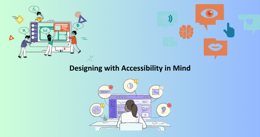
Building Clear Navigation and Logical Structure
Website navigation that is easy to understand, follow and come to should be one of the cornerstones of making a site accessible. Predictable patterns and logical ordering of pages are important for users with disabilities to move through content quickly. An organized and clearly labelled website with menus, breadcrumbs, and headers gives the users a general understanding of where they are and what can be done. The headings ought to be organized in true hierarchy and must use semantic HTML tags (<h1>, <h2>, <h3>, etc.) to indicate various sections of content, thus helping assistive technologies, such as screen readers, understand and announce them to the users correctly.
Furthermore, keyboard accessibility must be guaranteed in navigation menus. For instance, instead of using the mouse, a user can place his/her finger on the Tab key, activating logical passage through each menu item, each button, and each form field. The provision of a visible focus state (a highlight/mark around this selected element) or an indicator will allow users to know which one is active. Users would also be able to navigate without the tiresome movement of page scrawling from an area to another by having section headers or navigation bars that would remain fixed at the top of the screen. Also, including a “skip to main contents” link atop every page, users who depend on keyboard navigation will find it very useful. Simple and well-designed navigation increases everything from accessibility to user experience.
Choosing Accessible Fonts, Colors, and Visuals
Most designers neglect either typography or color when it comes to web designs that can improve accessibility. They need to be very readable, with spacing between letters, words, and lines also considered while choosing a font. Avoid using decorative fonts; stick with simple sans serifs like Arial, Verdana, or Open Sans. The user should be able to adjust font size using the browser settings without distorting the layout, and line length should be chosen to enhance reading efficiency — around 80 characters per line maximum is recommended. Dyslexic users could use extra spacing and fonts specifically designed for clarity.
Color contrast is another major consideration. If the contrast between the text and background is poor, it can be difficult for a user with visual impairments to read the text. The Web Content Accessibility Guidelines (WCAG) recommend a contrast ratio of 4.5:1 for normal text and 3:1 for large text. WebAIM Contrast Checker, among other tools, can help you in these tests with your color combinations. Do not depend on color alone to convey your message; example: a red text for error will definitely confuse a color-blind person. Use more than one cue, such as icons, labels, or underlining. Always provide alt text that meaningfully describes the content or purpose of the image for every photo included. These considerations render your website visually accessible without compromising its visual appeal.
Implementing Accessible Features and Functionalities
Ensuring Keyboard and Screen Reader Compatibility
Keyboard constitute one of most fundamental principles of web accessibility. Many users with mobility impairments utilize keyboards only to navigate websites. Your web store uses menus, buttons, forms, and any other action entirely with the use of a keyboard. Among the most common keys are Tab, Enter, Space, and arrow keys. Each interactive element such as links and input fields must be tabbed into in a logical order and must have some clear indication of focus when selected.
It is also essential for a website to function with the keyboard, not just with the screen reader. The screen reader converts written words into speech or the output equivalent of Braille and helps those with vision impairment understand and interact with the content. The HTML code will include proper ARIA labels, semantic tags, and descriptive alt attributes for images to make it successful to these tools. Dynamic changes, such as pop-ups or live notifications, should announce those changes to the users via ARIA live regions. Testing the website with some award-winning screen readers like NVDA (Windows) or VoiceOver (Mac) can reveal what visualizing cannot find. It is not just about ticking a box: making the site useable to screen reader users is all about providing equal access to all customers.
Designing Accessible Forms and Checkout Processes
Forms constitute the basic building blocks of any e-commerce website, starting from account registration followed by checkout. In contrast, poorly designed forms can pose significant accessibility barriers. Forms are a visible label for every form field, which should be clearly associated with its respective input element. Placeholder text cannot serve in lieu of a label because it fades away as users start to type in a field, causing potential confusion. For users dependent on assistive technologies, field labels, error messages, and instructions must be programmatically linked using the appropriate HTML attributes for, id, and aria-describedby.
The other most important factor is error handling, as error messages following forms need to be clearly displayed, easy to understand, and related to the respective field whenever something is missing or incorrect in the submission of a form. It is best to keep the message simple, explaining what went wrong and how to fix the issue. You can also incorporate real-time validation while the user types to further help in resolving mistakes. All this information should also be presented to support keyboard-only navigation through the entire checkout process, avoiding complex interactions like drag-and-drop or autofocusing fields, which may confuse or entrap users. Multiple payment modes, progress indicators, and a summary of the order taken at the last step further reduce friction so that all customers can be enabled to complete their purchases successfully.
Testing and Maintaining Accessibility
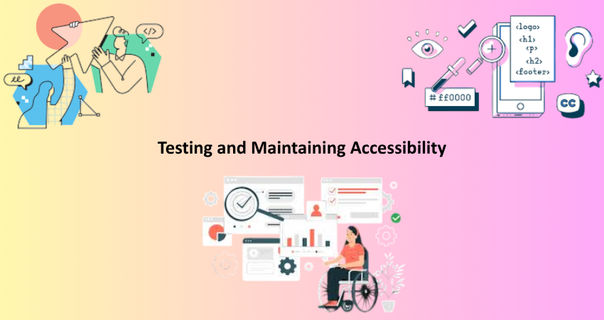
Tools and Techniques for Accessibility Testing
For ensuring the online shop’s visibility by all users, it highly matters the importance of accessibility testing. There are various tools for testing and correcting accessibility issues. Automated tools like WAVE, AXE, and Lighthouse analyze pages and report common issues, including missing alt text, poor color contrast, or improper heading structure. These tools work well for fast checks and debugging in the early stages, but manual testing is needed to pinpoint some issues that might slip through automation’s fingers.
Manual testing involves testing the site in the same ways that a user with a disability might navigate it. Try navigating through your website only with the keyboard to check if the tab order flows logically and whether all interactive elements can be reached. Run a screen reader and see how the content is announced, which buttons, links, and images are ineffably clear. You should also test the site on different devices, browsers, and screen sizes so that a user may have a consistent and accessible experience regardless of the platform used. Inviting users with disabilities to your usability studies or feedback forms will bring you more insights into the test process. Accessibility testing is not a one-time exercise but rather a continuous process that should go for every cycle of development, design iteration, and feature rollout.
Keeping Accessibility in Your Development Workflow
For your long-term sustainability, you must weave inclusive design into your development workflow from day one. Making accessibility an afterthought or something to, well, “do-something-about-it-later” just won’t work. Accessibility issues need to be addressed in every phase of the project cycle-wires sensitive to the built and unbuilt environment, prototyping, coding, testing, and deployment. Design systems and component libraries developed for accessibility should be used. The design and development teams should be educated about WCAG weights and best practices to be consistent and compliant.
Accessibility checks can be integrated into the workflow of version control systems and CI/CD pipelines through tools like Pa11y or Lighthouse CI. This allows for automated testing with every commit or pull request to catch issues early on. Documenting your accessibility strategy, known limitations, test protocols, and remediation strategies keeps your team in agreement. Facilitate conversations about accessibility and clearly designate ownership of continued updates. Establishing a culture of accessibility fosters continuous usability, inclusivity, and legal compliance of your online store.
Conclusion
Building an accessible online store is more than a legal requirement or a technical hurdle; it creates a virtual space where every customer feels welcomed and respected by all people and empowered. Accessible e-commerce-from learning the basic principles of accessibility to developing thoughtful design choices-has no leave-behind users. Every decision made, from your fonts and colors to your keyboard navigations and checkout forms, either brings users in or keeps them out. This guide demonstrates accessibility is possible even for novices and that very much more devolves to the much-greater good of compliance.
Its product manifests that with better design, one can get an optimal user experience with better SEO, greater customer loyalty, and a huge potential market. It also connects to and shows social value by your brand to what it stands for as finally committed to inclusion. So continue your journey, really. After all, accessibility is more like a continuous strip than doing just one task. Technology changes, customer needs change, and standards keep coming up with newer innovations. Information, testing, and feedback play a key role in keeping one’s track along the journey. It is possible to build a better store today, but it is also a responsibility to build a better web for everyone.