Introduction to Color Psychology in E-commerce
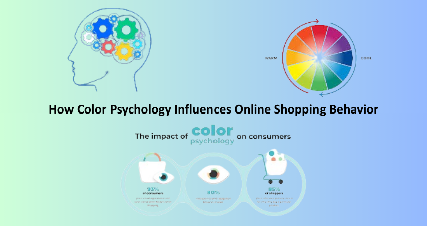
Color psychology holds great value in studying consumer behavior, especially in the digital age. Color psychology studies how colors impact the emotions, perception, and actions of a consumer. Knowledge of color psychology is important while preparing strategies to market an item on e-commerce and help create a positive customer experience, particularly since it is a channel where customers are largely influenced by visual stimuli. Since touch, smell, or any physical interaction cannot be guaranteed to be present in online stores, colors, therefore, should do more than beautify; they must also communicate and convert.
First impressions are extremely fast, and color is one of the contributing factors. As a matter of fact, studies have shown that color alone accounts for as much as 90% of a customer’s judgment of a product. The strategic use of colors, therefore, can lead to conversions, decrease bouncing rates, and hence consumer satisfaction. E-retailers who understand the psychological colour triggers will create designs that calm, excite, imply urgency, or generate trust, depending on the desired customer reaction.
The Emotional Impact of Colors on Shoppers
Warm Colors: Creating Urgency and Excitement
The warm colors such as red, orange, and yellow are among the colors that create strong emotions. For example, red is exciting and creates urgency, which is the reason it is mostly found in clearance sales and call-to-action buttons. It captures attention and gives a sense of urgency or importance to create a better chance of danger that pushes users to make quicker choices. It works wonders for limited-time offers and discount banners. Orange is a mix of red and yellow and is so called because this color makes one enthusiastic and full of fresh ideas. It is mostly used in deals or friendliness.
However, the magic of warm colors should be used sparingly, for if they are used excessively, they can make one feel tense or aggressive, thus scaring away potential customers. Although yellow denotes optimism and cheerfulness, it can be too much if used in large quantities. It best serves as an accent to highlight the critical features without overshadowing the whole look. Warm colors in moderation inspire action by the users while creating a conducive shopping environment.
Cool Colors: Inspiring Trust and Calm
Blue, green, and purple are all cool colors reflected in the resultant emotions of calmness, trust, and security as part of an effect to turn browsers into buyers. Blue, trusted as the most apparent shade in cyberspace, is adopted massively by financial and health organizations. It also gives a feeling of reliability and tranquility in e-commerce, promising the customer that its transactions will stand safe. Thus, it is very appropriate for checkout buttons, security messages, or customer service areas, conferring with the consumer the safety of transaction.
On the other hand, green relates to prosperity, tranquility, and nature, a category signifying almost every green product consistently eco-friendly or health conscious. In addition to this, green most often is dubbed wealthier, hence it makes this color just right for the purchase now or add to cart buttons. Purple is typically associated with luxury and artistry, making it more extensive to niche markets, thus creating room for art targeting or high-class consumers. The application of cool colors can strategically build reliability and comfort for longer site visits and much improved conversion.
Gender and Cultural Preferences in Color Choices
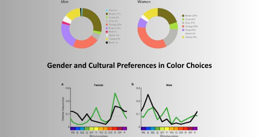
Gender Differences in Color Perception
Men and women respond differently to colors, which is something e-commerce platforms must keep in mind. According to research, blue is universally appealing, while purple is more women’s than men’s color. Men, on the other hand, fancy strong, straightforward colors like black or red. Knowing this will help tailor user experience on the basis of demographic data. For example, a female buyer site might have more purples and pastels, while a male-focused store might lean toward greys, blues, or darker tones.
This is particularly important in fashion, cosmetics, and lifestyle. The websites that can successfully match the color palette with the audience will tend to engender an emotional connection and loyalty. However, over-generalization is also a hazard. Behavioral segmentation is likely to prove more productive than segmentation through general assumptions for gathering design insights. Testing different colors for an A/B audience based on gender an outlook can yield invaluable insights into what actually works for each segment.
Cultural Interpretations of Colors
Colors, from the cultural meanings they carry, actually influence global e-commerce strategies significantly. For example, whereas in most of the Western World, white is equated with purity, some Eastern cultures regard white as a symbol of mourning. Some other things include red, which can mean luck and celebration in China while from the Western point of view can signal warnings. These kinds of differences can influence a customer’s decision to trust a brand and complete purchasing actions.
When developing a global e-commerce platform, cultural differences like these have to be addresses in regards to it. Customizing certain color schemes with local relevance should help avoid misjudgments and thus create a deeper bond with the audience. It’s beyond just referring colors across countries; it is respecting and connecting ingrained cultural sentiments. With the right colors reaching markets, brands can extend themselves much more, thus amassing wider reach and affinity towards stronger brands worldwide.
Color and Conversion Rate Optimization (CRO)
How Button Colors Influence Clicks
The shade of call-to-action buttons is capable of influencing conversion rate. A/B test usually shows minor modifications in button colors, but their variations render good results on the general performance. Buttons colored either red or orange are usually tied with an assurance of urgency, but might be limited with color trends present on the page. A call to action needs to stand out, so it has to register clear contrast. If your website palette is cool, to attract attention, the site pallette has to bring warm- colored buttons.
On top of that, Well defied visibility, the psychological impact of button color should reflect what action you want them to take. For example, if buttons go “Proceed to Checkout,” people would perceive the color green to indicate growth and flow to bring action. Correspondingly, a “Submit Payment” action would make use of a blue button, which is considered safe and stable. By having a handle about how different combinations of color will drag people’s minds through or into specific activities, designers could effectively lure visitors to undergo activities.
Color Harmony and Site Aesthetics
Color harmony is relevant to improving an entire site because distinctly vibrant elements like CTA buttons will pop bright and harbored soul-waking experience of shopping. Very poorly chosen or contending colors can overwhelm the visitor, which leads to higher bounce rates. Color harmony uses set palettes reflecting the brand’s personality and seamless visual experience across pages. Also, tools like Adobe Color or Coolors can help designers create aesthetics-in-function harmony.
Site aesthetics driven by consistent color might create trust and credibility. Visitors are more likely to feel they have the needed comfort to access a site that looks well-thought-out and professionally polished. The relative familiarity would increase usability and satisfaction gained from visiting a given site if for the visitor there is consistency in the color used throughout banners, menus, and product pages. In short, while all-important parts pop, the whole color strategy should also work towards a unified experience that is pleasing optically to the user.
Practical Applications and Case Studies

Real-World Examples of Color Strategy Success
Such type of example is demonstrated by the big retail houses, like Amazon which applies the very smart psychological impact of color in design using the orange for its ‘Add to Cart’ button, representing enthusiasm and quickness. So their background is very simple, making the CTA the center of attention. And, speaking of Spotify usage for example, the vibrant green really complements the brand’s energetic and inclusive nature yet also prompts the action of subscribing or listening without much hesitation.
Another such example is Glossier-a cosmetics brand-needs to evoke soft pinks and whites that read very clean, feminine, and friendly. This matches with the target market of young women who want a brand that is minimalistic and approachable. Here lies proof that perfect amalgamation of color with brand values and the psychology of users could, in fact, create an experience that would pave the way for profits.
Lessons from Failed Color Implementations
Not every time a company turns to color psychology will it pull off that marketing strategy. Brands that fail to consider the emotional or cultural context of their color choices run the risk of turning potential customers away. For example, if a website featuring luxury goods uses ridiculously obnoxious reds, those tones tend to cheapen the perception of such goods. Perhaps a use of a super-high-contrast palette might render the site impossible for visually impaired users to navigate.
Another case of backlash saw a company launching globally without appropriate regional readjustment; its rejection and bad performance were localized in some markets. All these failures talk of the imperative need for testing and localization. Color psychology cannot be a blanket solution; brands should adjust and refine their color strategies based on feedback, testing, and ever-evolving user expectations.
Conclusion
Color plays a major role in online shopping behavior. It is responsible for first impressions, for example, and it can even hang on and influence purchase decisions. Thus, colors in e-commerce environments have a huge impact on user experience and conversion rates. If subliminal messages are a function of color, emotional, cultural, and psychological elements should be incorporated by a brand in forming interfaces that touch its target markets.
Employ a provision of getting color-differentiated experiences to be relatable to different demographics and cultural differences, subjecting them to continuous tests and optimizations. In this way, colors could translate into power tools when it comes to enhancing engagements and sales. In the cutthroat competition of e-commerce, where span attention is short and competition breathes down one another’s necks, they will not be the same—cast into a cutthroat competition, mastering color psychology would not be an option but a must for successful accomplishment.
While establishing a new shop or modifying an existing one, keep all color choices towards backing a brand message, user journey, and business goals. The right colors build trust, instigate action, and convert visiting browsers into loyal customers. The stronger personal touch and viscerality added to digital shopping will make the color much stronger in the strategic sense.